We're designing a new look and feel for OSMC
We went through a few iterations of the OSMC skin last year. While we're making it ready for Kodi 17 (Krypton), which is due in the Summer, we'd also like to improve the skin at the same time.
Our look and feel has evolved a lot over the last few months , and we want to update our skin to reflect that. Many of you will no doubt already have favourite skins, but we feel that there is a place for a well designed OSMC skin that provides a unique look and feel.
We made some changes to our skin in June, and some of you liked the new changes, and some of you didn't. We believe that your feedback is an important part of making the new OSMC skin as user friendly and visually stunning as possible for as many different users as possible.
Here's a look at what we've been working on:
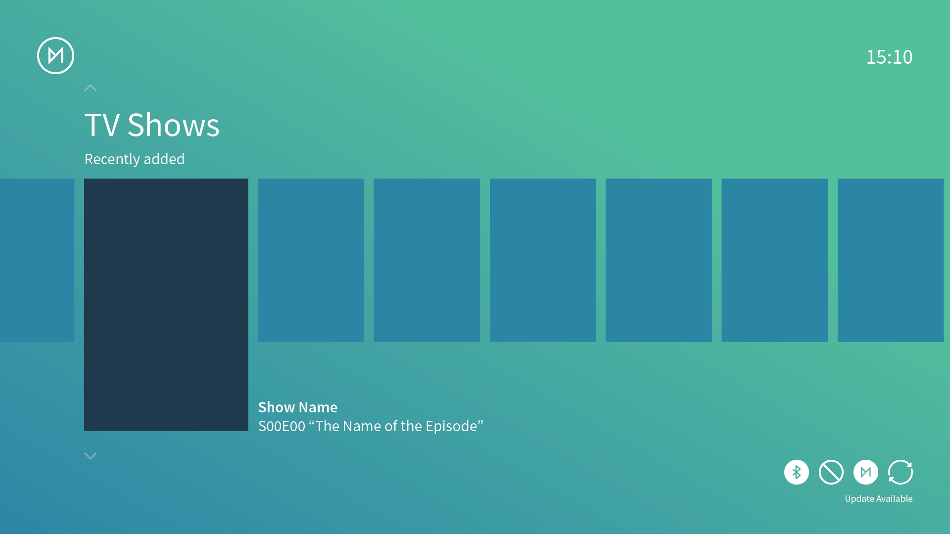
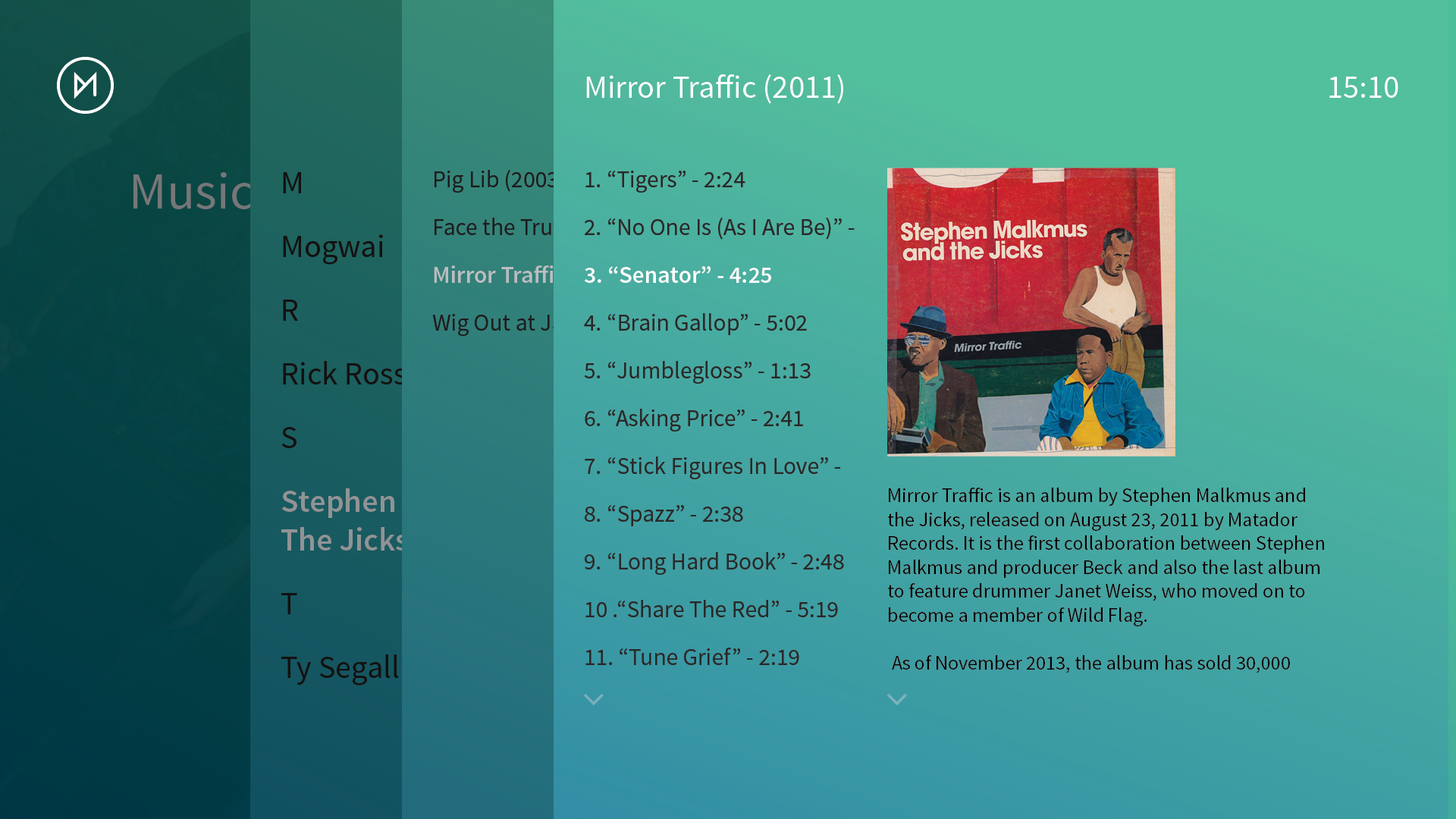
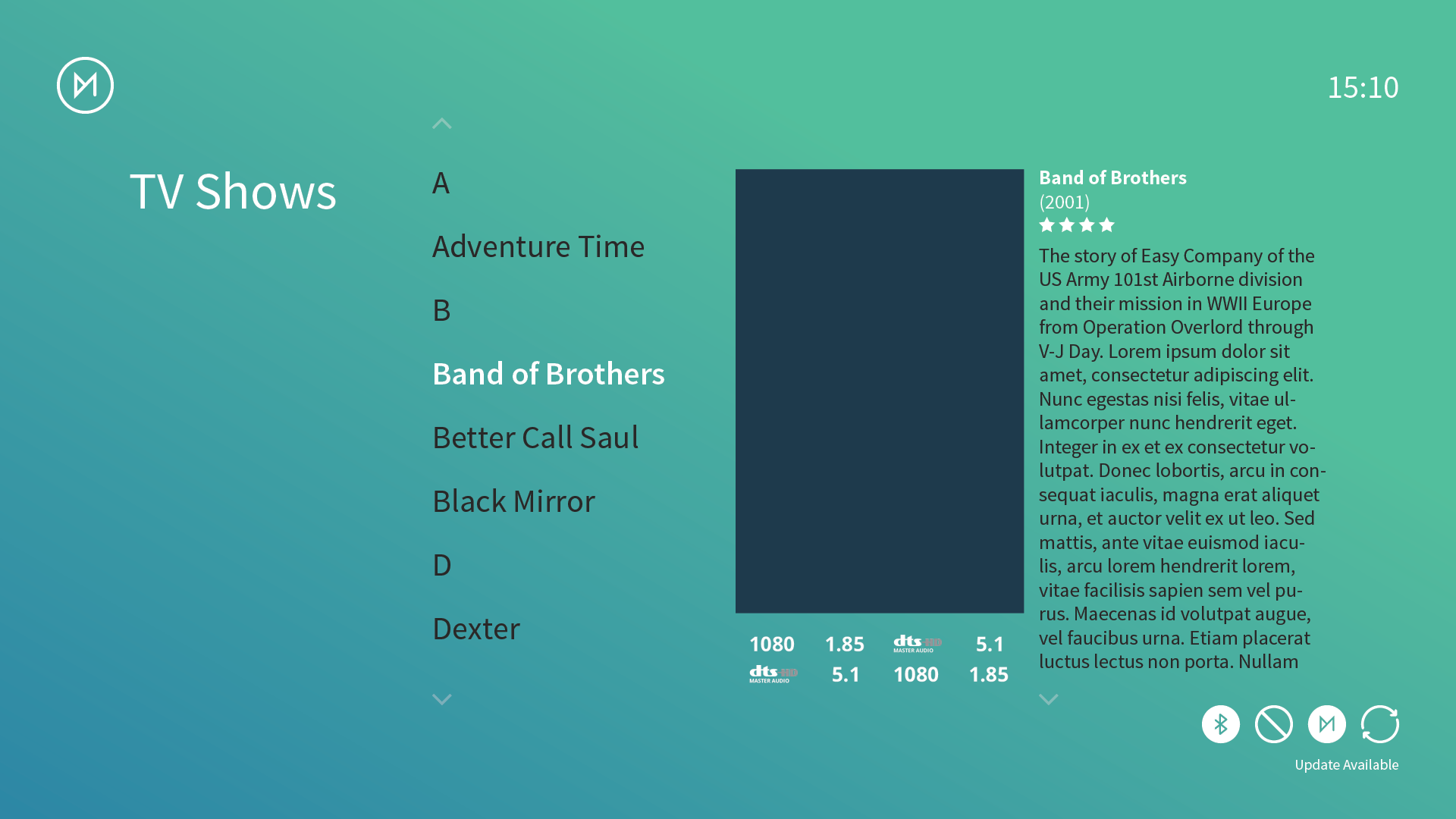
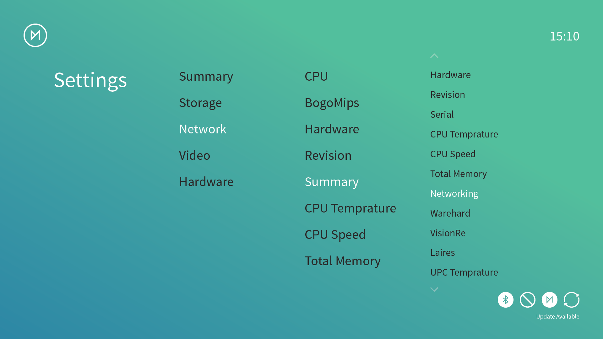
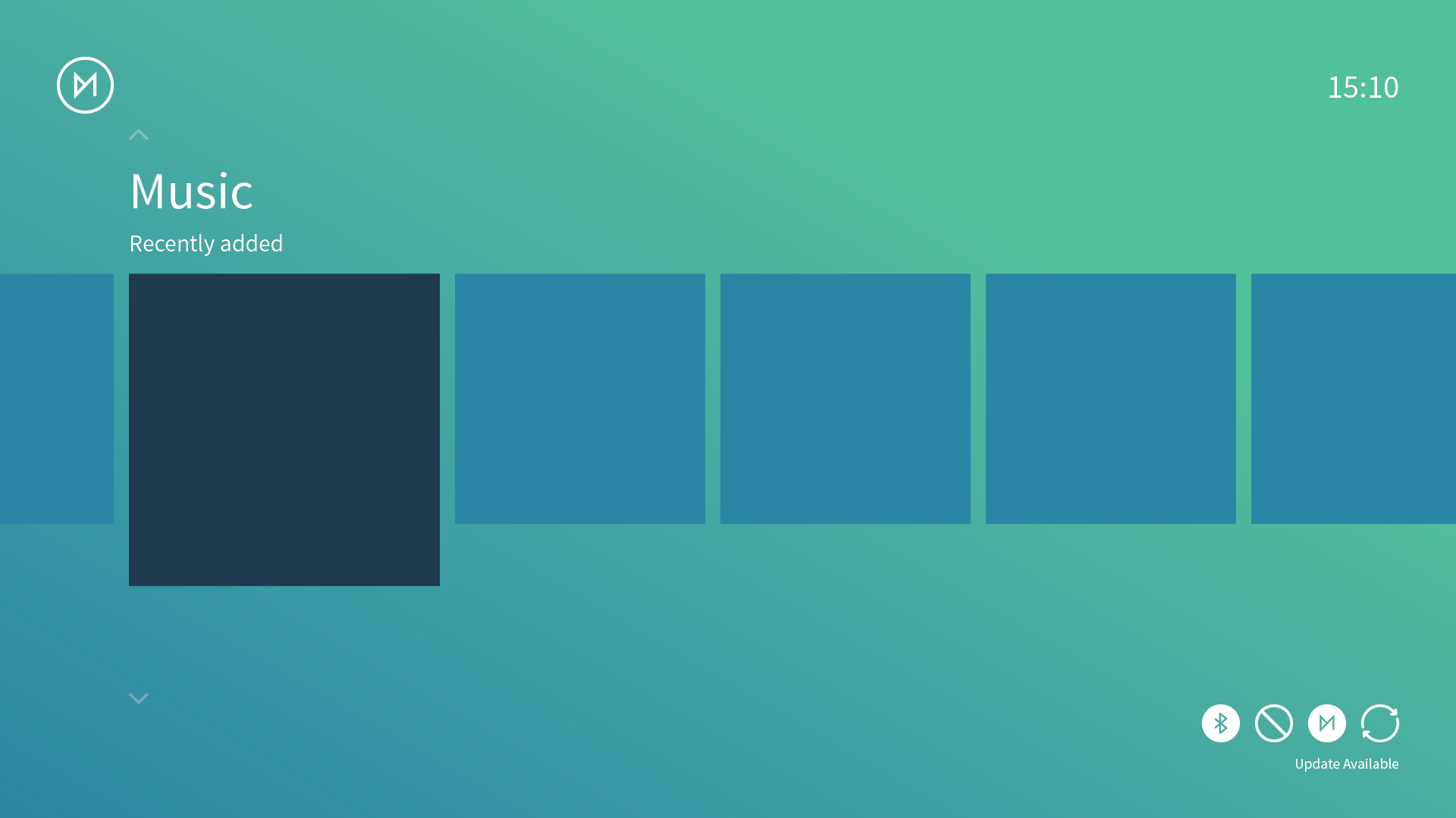
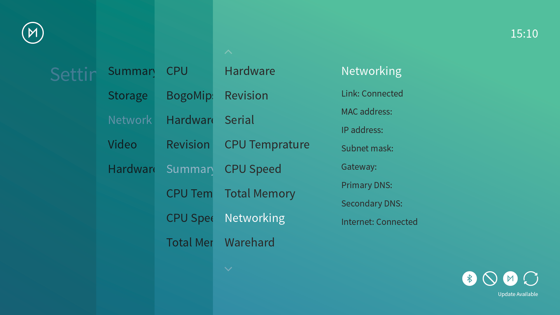
Some of the team are at odds with the background and gradient, so we also had some other ideas:
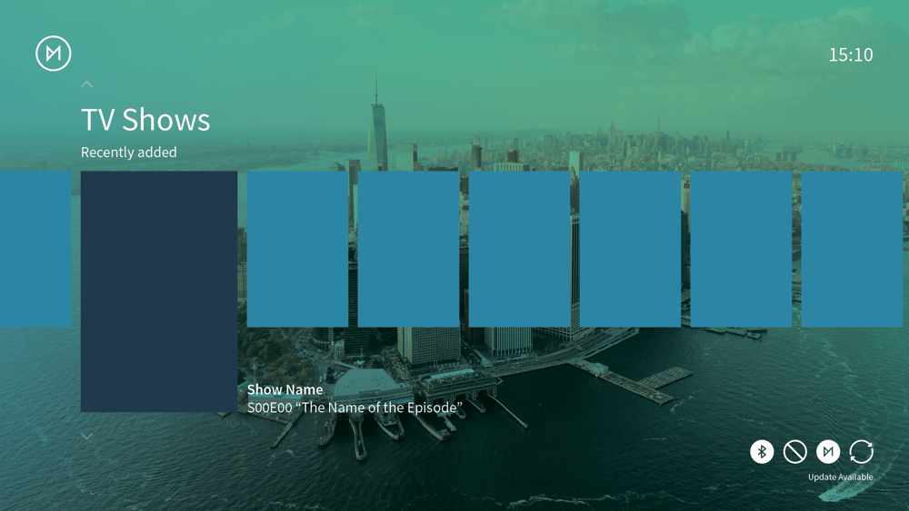
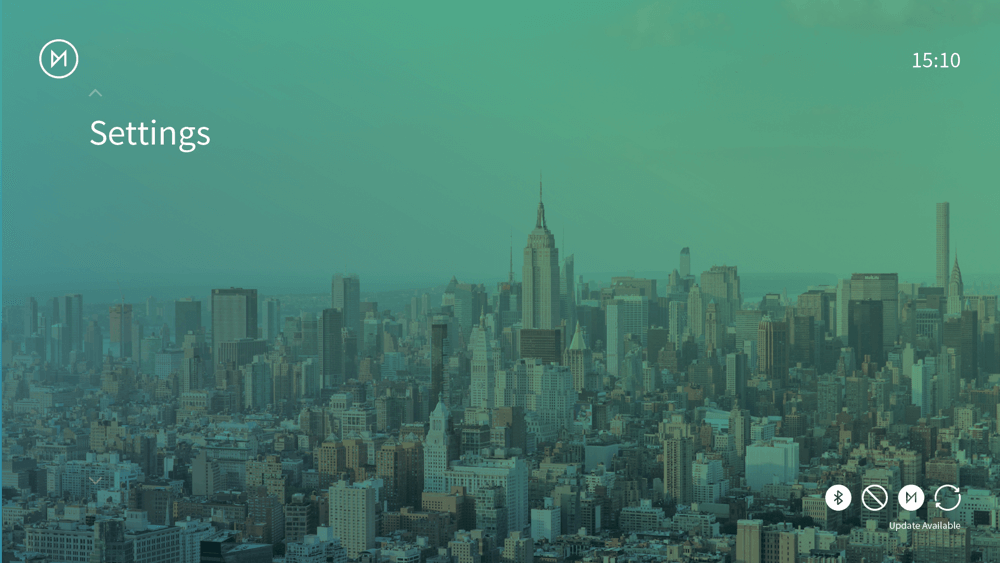
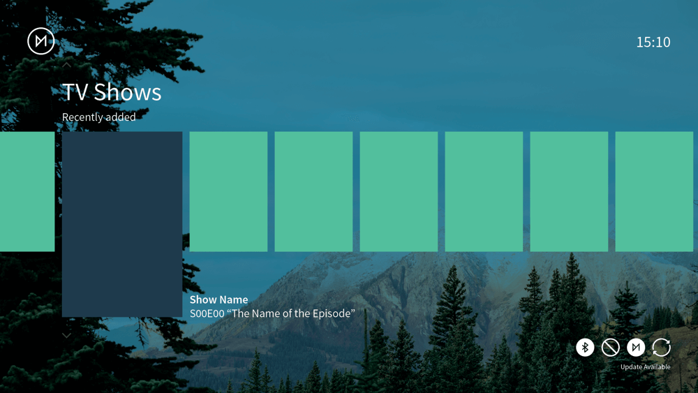
Join the discussion below and let us know your thoughts! We'd like to work with the community closely as we develop this new skin.
Comments