The OSMC Skin redesign
It's been nearly five years since the last big change to the OSMC Skin and with our next update which will introduce Kodi v19 (codename Matrix) and our new video stack, we'd like to introduce some design changes to the OSMC skin.
The basic structure and look of texts, buttons and fanart will remain the same. There will however be some changes to how background colours are shown and how they structure the overall layout of every window and dialogue. Additionally, we've chosen to use a new default colour scheme but have retained the option to use the old colours via the colour sets in the skin settings.
Here are some screen shots to give you an idea of how things will look when the next OSMC update lands imminently.
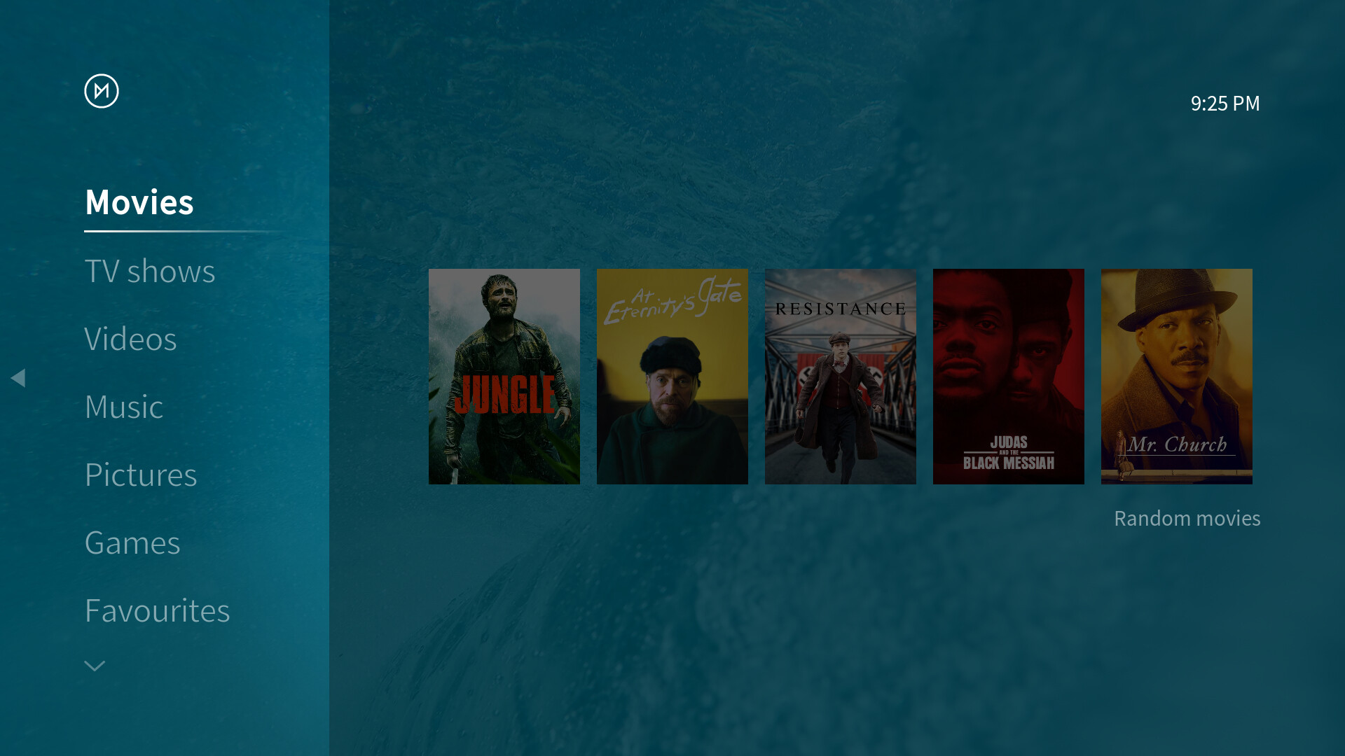
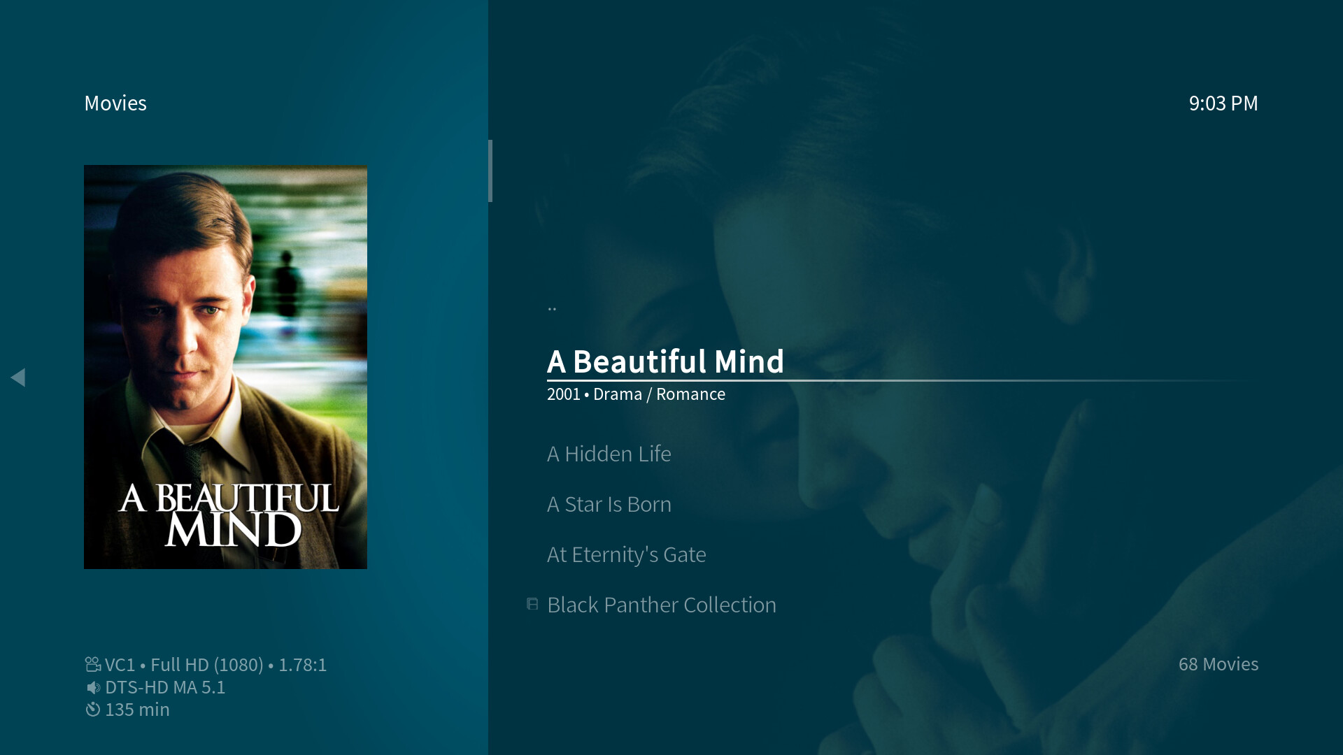



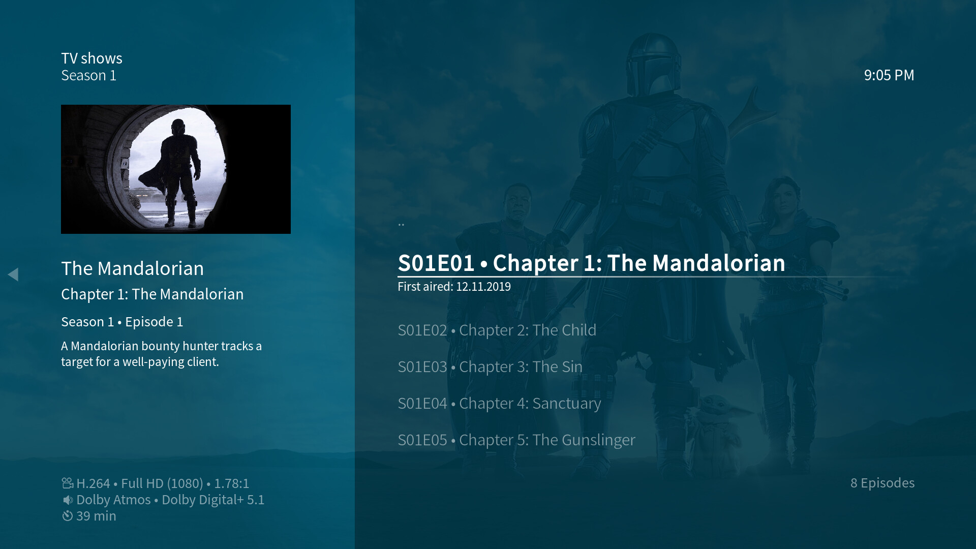
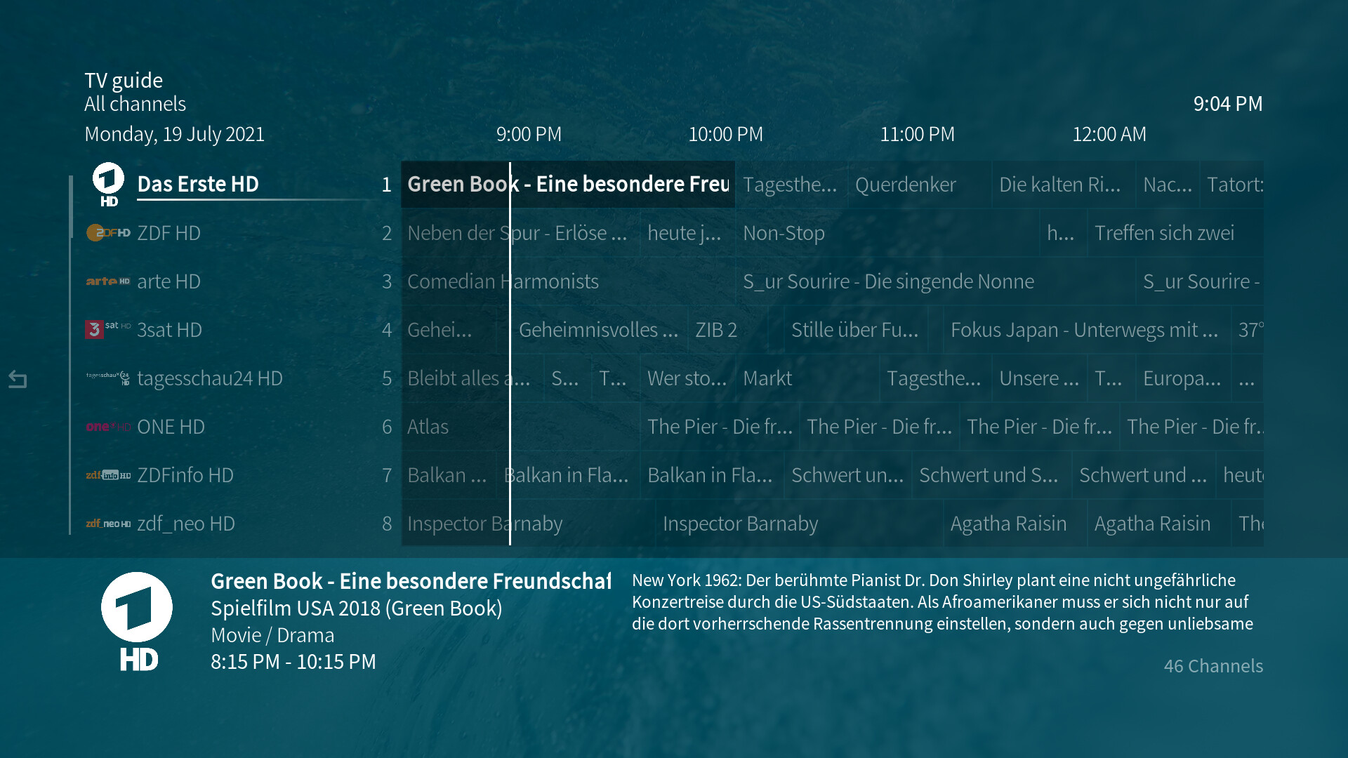

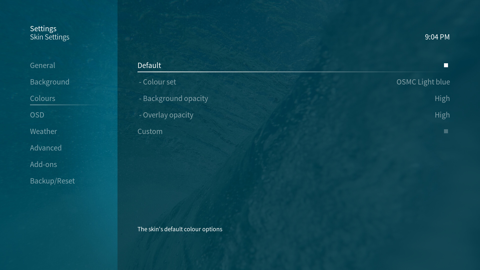
The new design is meant to structure the different parts of each window or dialogue in to clearly separated areas, with the left and right side of a vertical list window or the top and bottom of a horizontal list window which maintaining a light and transparent look.
To reiterate -- all colour and opacity customisation settings that you're used to are still available with this skin overhaul, just in case you want to adjust things to your own taste.
We hope you like these changes and we're looking forward to delivering this refreshed look and feel to you soon in the next update. If you'd like to test these changes already, you can find test builds for Raspberry Pi here and test builds for Vero 4K/4K+ here. Please note that this will upgrade you to Kodi v19 (codename Matrix) and you should read what this means before updating.
Comments