The OSMC Skin
This wiki article should cover most of your general questions about what the OSMC Skin features, how it works and how you can customize it.
Design principles of the OSMC Skin
Our main objective is to deliver a minimalistic, sleek and simple skin that is easy to understand for beginners as well as successful at delivering lots of toggles to those interested in customizing their OSMC experience to their taste and habits.
Having said that, we always try to keep the balance between easily understandable options to adjust the skin and covering most users’ requests, interests and tastes. This balance will not always be perfect, but we’re always keen to hear from users about ideas they have or inspiration they can give us for new features or additions and improvements. If you have a request for us, feel free to post it in the forum’s feature requests section and we’ll respond and consider it as soon as we can.
Features of the OSMC Skin
- easy to understand navigation
- mutiple views for media windows
- lots of customization options for:
- the main menu including widget support
- video and music library views
- media flags
- the video info dialog
- video and audio player OSD behaviour
- all skin colours
- general visibility and readability
- easy to use skin settings reset and backup functionality
- support for multiple addons widely used with Kodi skins
Versions of the OSMC Skin
The OSMC Skin comes in four different versions:
- the standard OSMC Skin which supports a 16:9 screen aspect ratio
- the cinemascope/CIH version of the OSMC Skin which is a 16:9 skin as well with options to mask the top and the bottom with black bars for 2.40:1, 2.35:1, 2.33:1 and 2.00:1 aspect ratios. All controls are located in the middle of the screen with space to the top and bottom edge:
And there are native 21:9 and 4:3 versions of the skin as well.
How to get the OSMC Skin
The OSMC Skin as well as all other versions of the OSMC Skin are shipped with OSMC releases by default. If you’re not using an OSMC platform, you may look at installing our OSMC Skin repo that will keep the OSMC Skin up-to-date on other Kodi platforms.
How to navigate the OSMC Skin
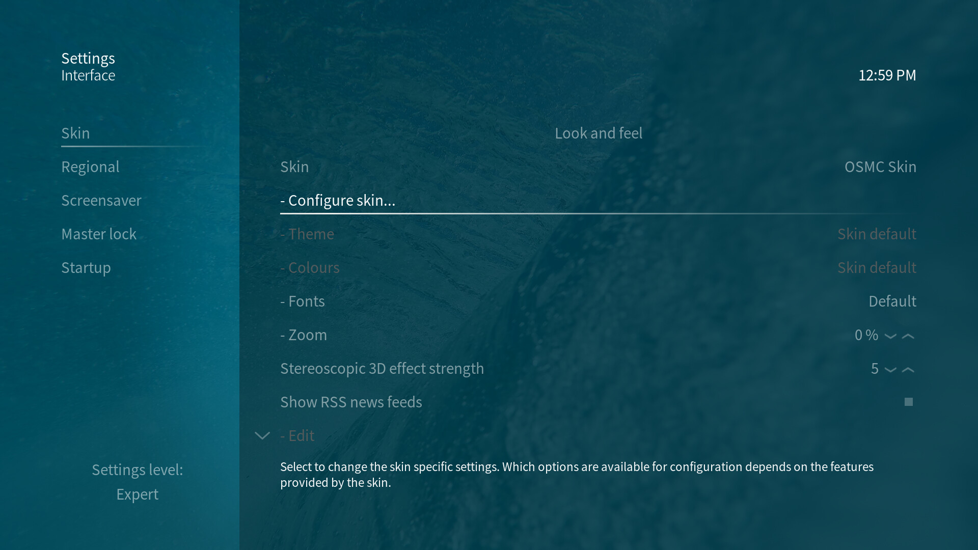
The skin settings are accessible by clicking Settings in the main menu and by navigating to this location: Interface → Skin → Configure skin… Here, you’ll find lots of customization options each explained with a small explanation text box at the bottom of the skin settings window.
The OSMC Skin features a few principal navigational hints:
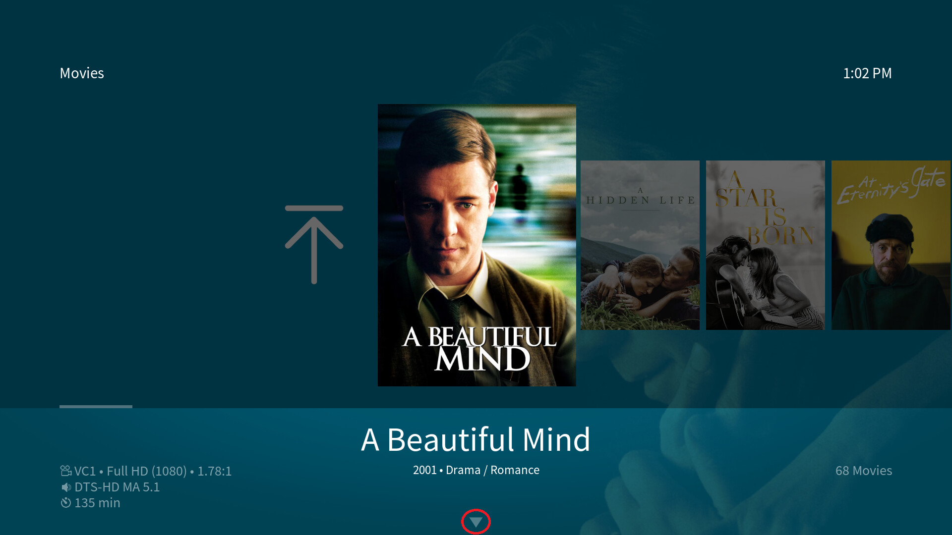
Arrow indicators
Shown on the top and the bottom of vertical lists in the main menu and the settings section:
These indicators show you whether the list is longer to the top or the bottom than what you can currently see on screen.
Scrollbars
Shown next to all lists except those which use arrow indicators:

Scrollbars enable you to see whether a list contains more items than currently visible on screen as well as letting you navigate through a list more quickly. If you focus a scrollbar, you can jump up or down in a list page by page instead of item by item. Scrollbars can be focused by clicking the direction button representing the direction the scollbar is located in from the currently focused element.
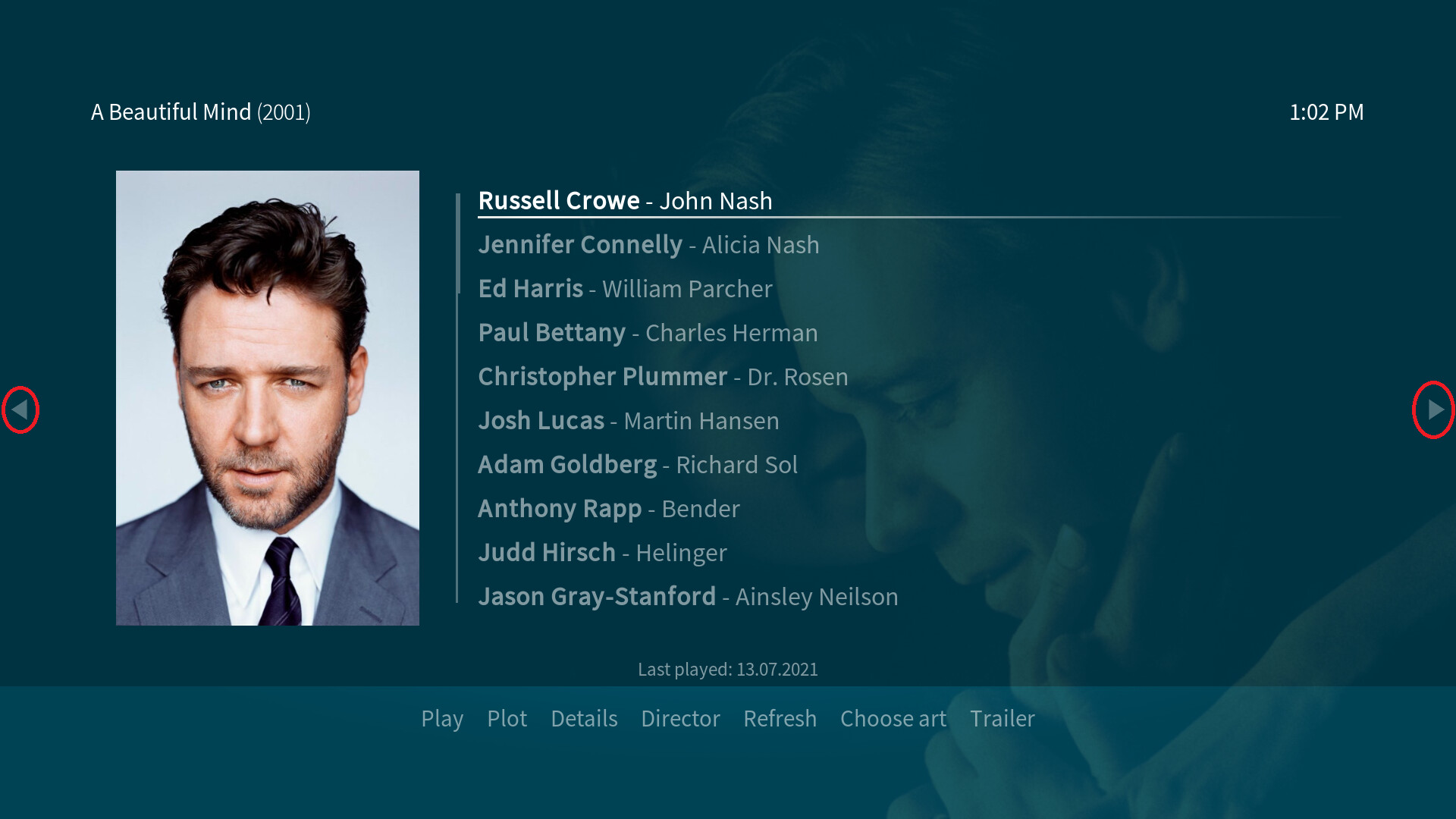
Button indicators at the edge of the screen
Shown in windows that feature submenus or in dialogs:
Button indicators indicate that a submenu is available. This also applies to other windows where the indicator may also be on the bottom of the screen. The indicator shows you which button you have to press to open the submenu: in most cases the left or down button.
There’s one special case which is the PVR guide window where you have to press the back/return button first in order to highlight the scrollbar and before being able to open the submenu.
In dialogs the arrow button indicators are mostly shown as well - on the left and right side of the screen. They indicate which button you have to press in order to get to the horizontal dialog button menu at the bottom of the dialog: the left or right button.
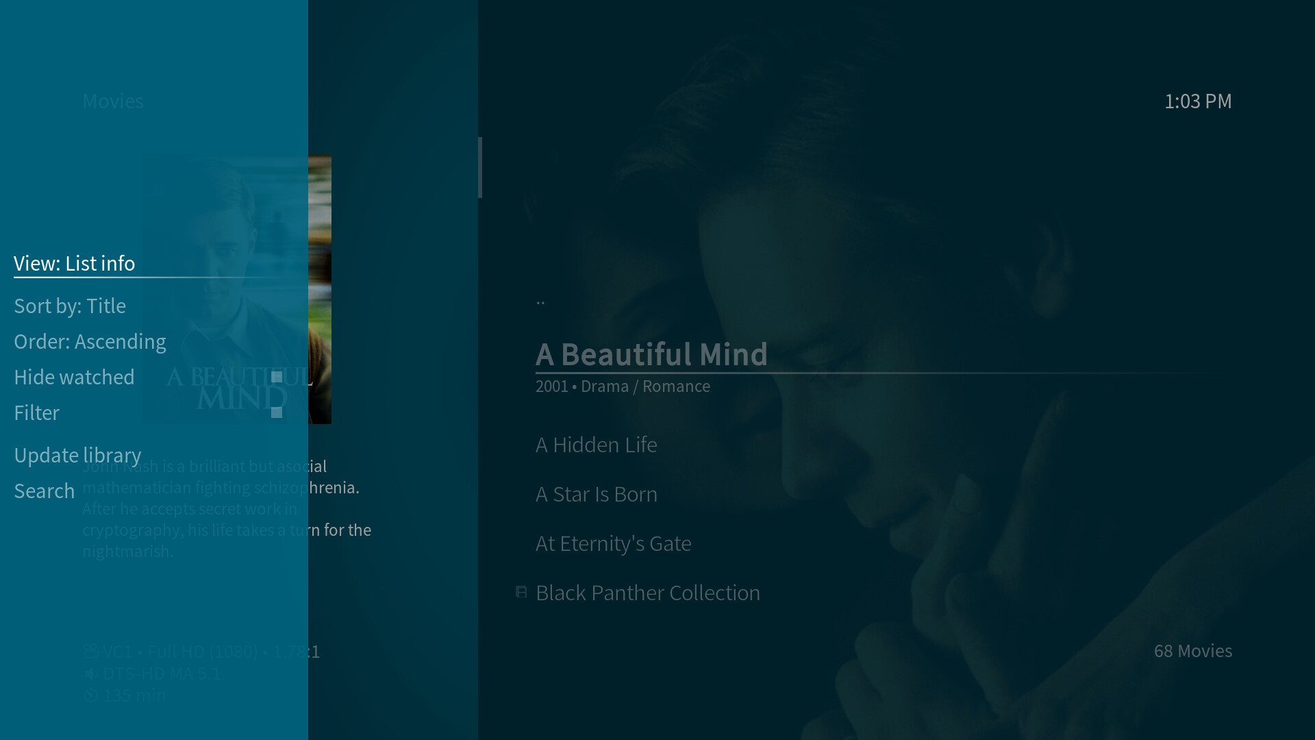
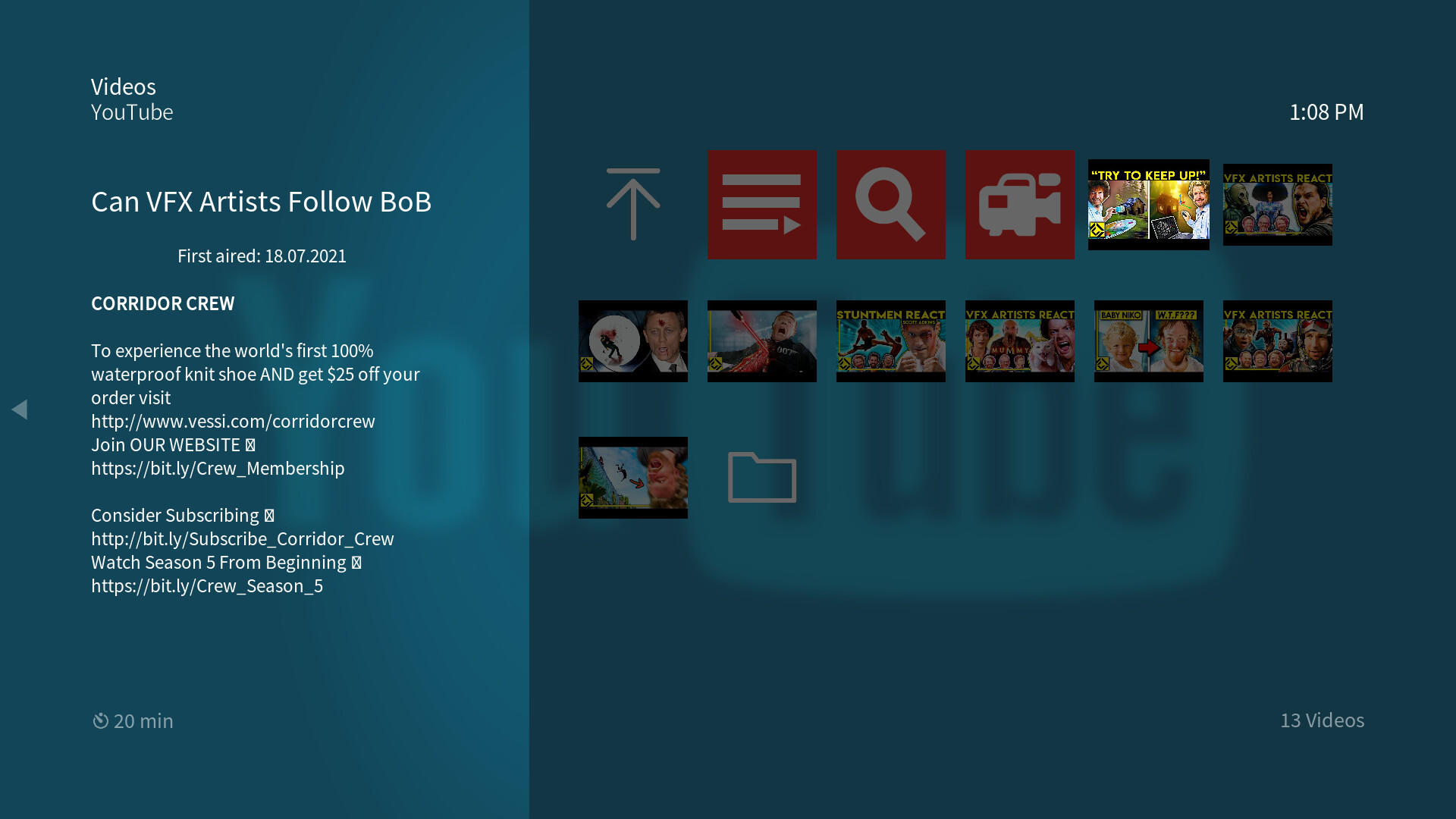
The submenu
The submenu (keyboard button shortcut: m) offers access to a view toggle that lets you switch which view is used in the current window as well as different toggles for sort keyword and order, a filter and search option and some other options specific to the current window. During background playback there’re also basic playback controls shown below the last option in the submenus. These basic controls can be hidden, if not wanted/needed via a skin setting.
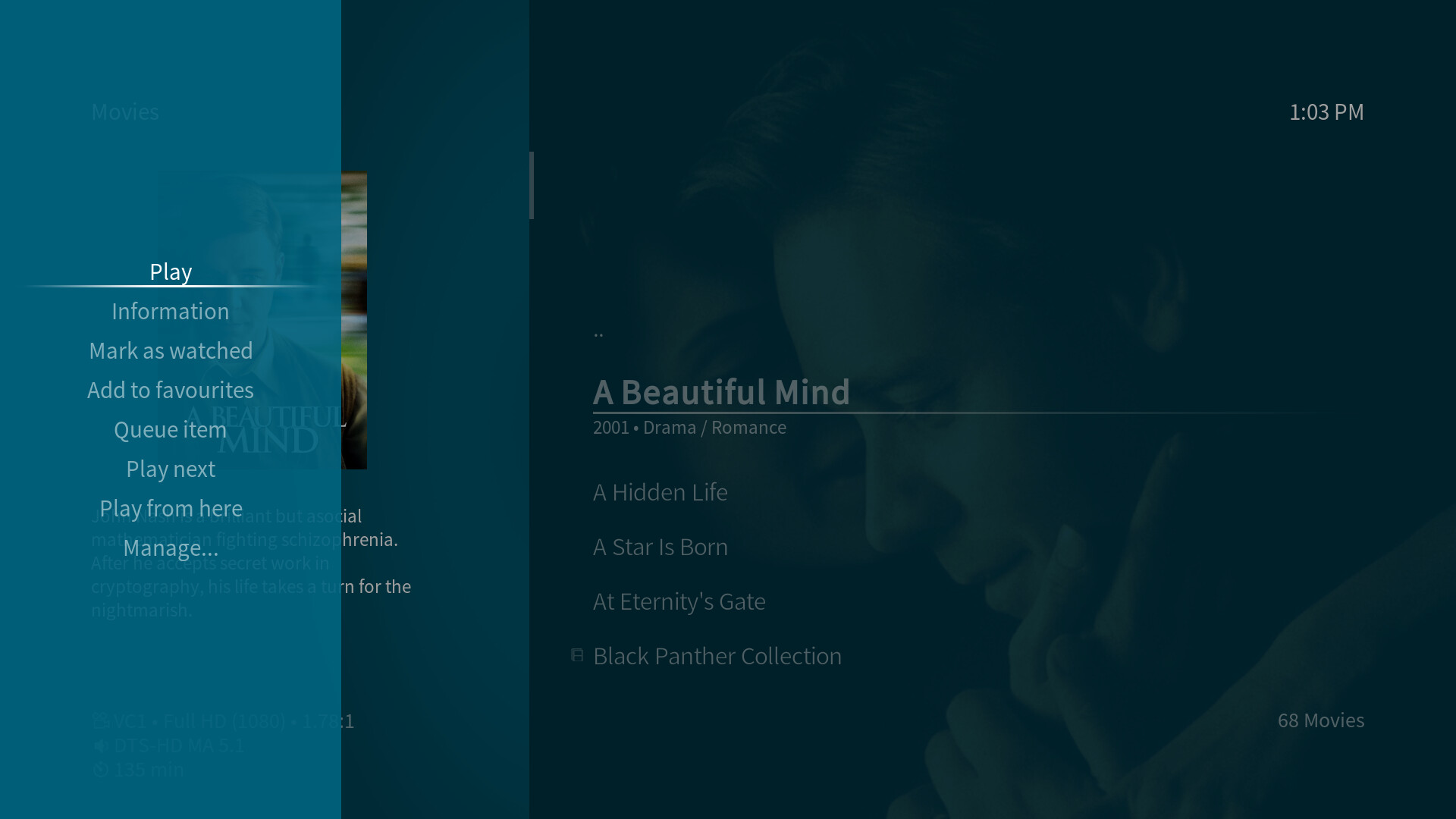
The context menu
The context menu (three line button on the OSMC remote or c on a keyboard) is available for every item currently focused in media windows. It looks slightly different than the submenu.
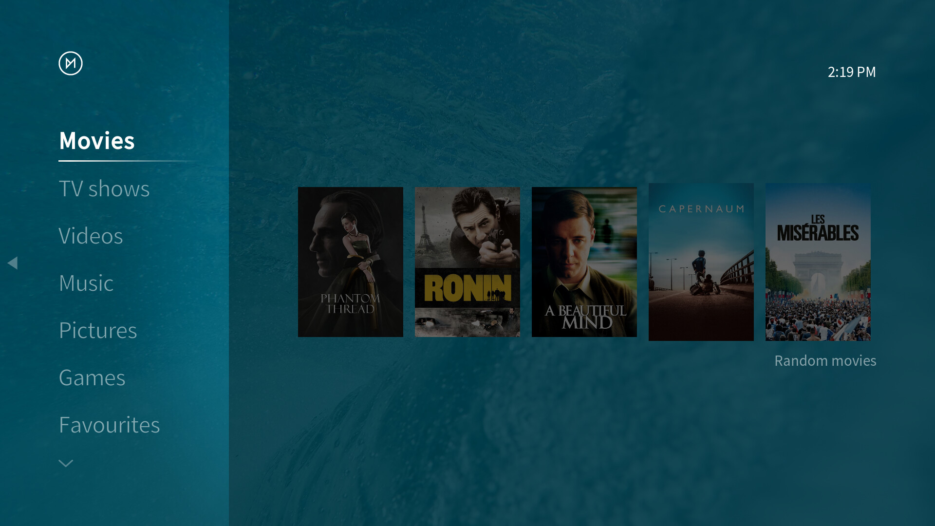
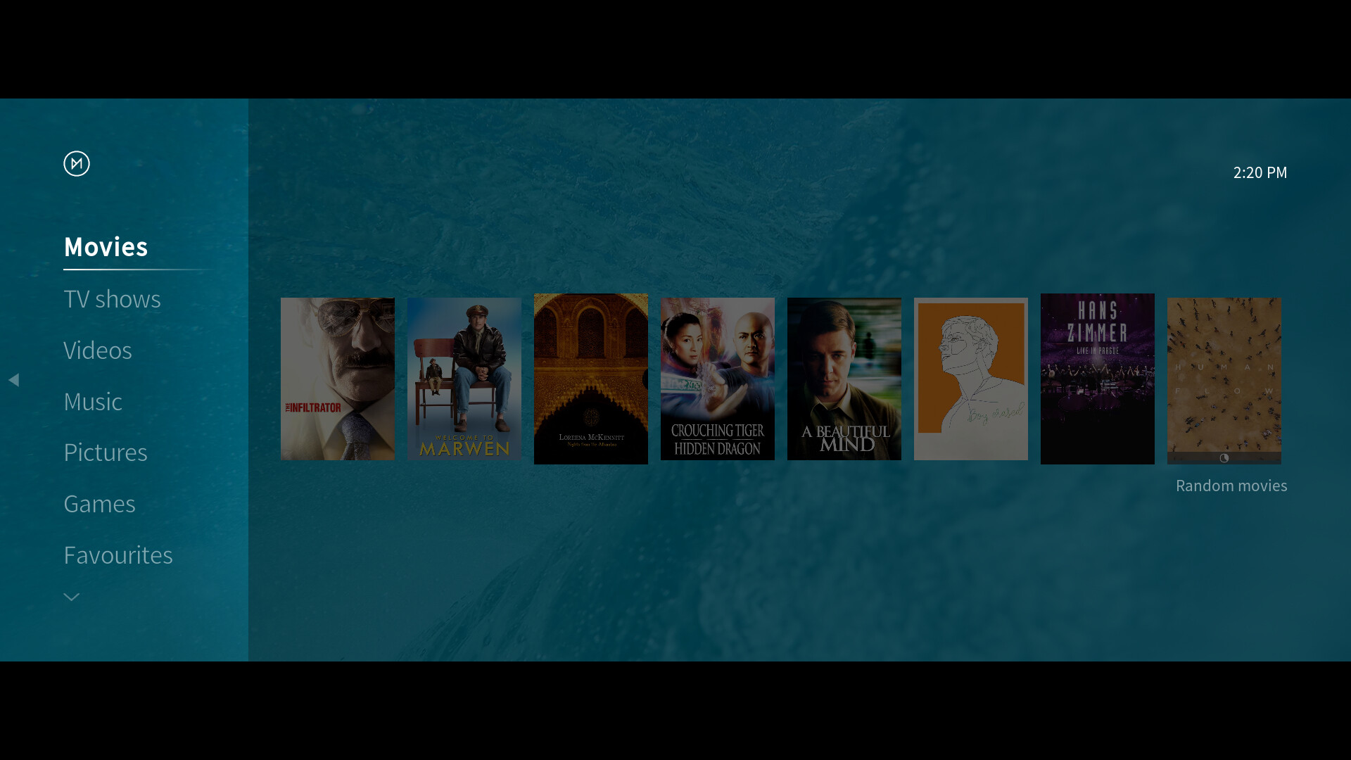
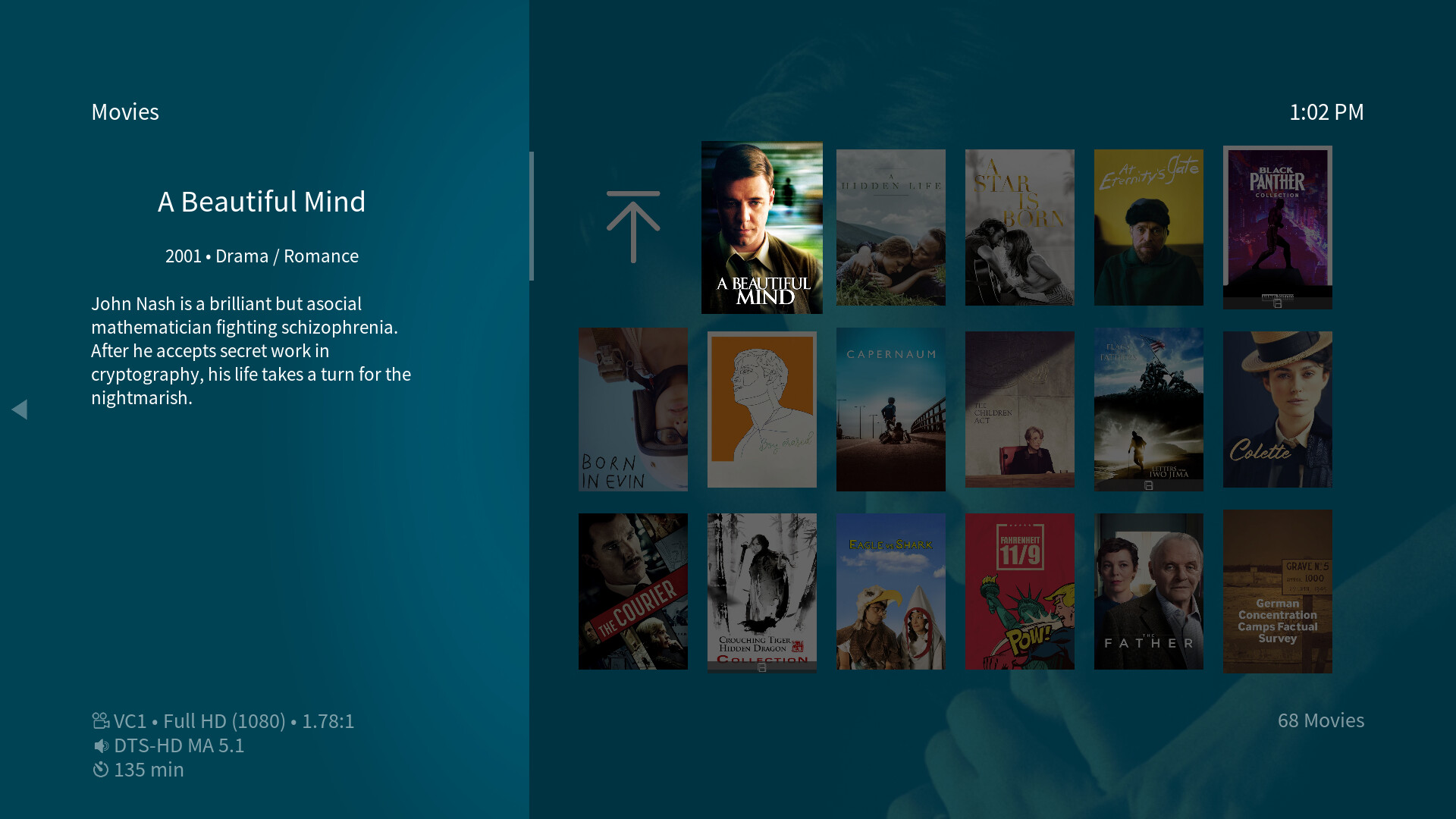
Media window views
For windows like video, music, picture or games the OSMC Skin features a range of different views that should allow everyone to select the right look matching their taste and needs.
Here’s a short overview over which media views the OSMC Skin offers and where those views are available to select:
List
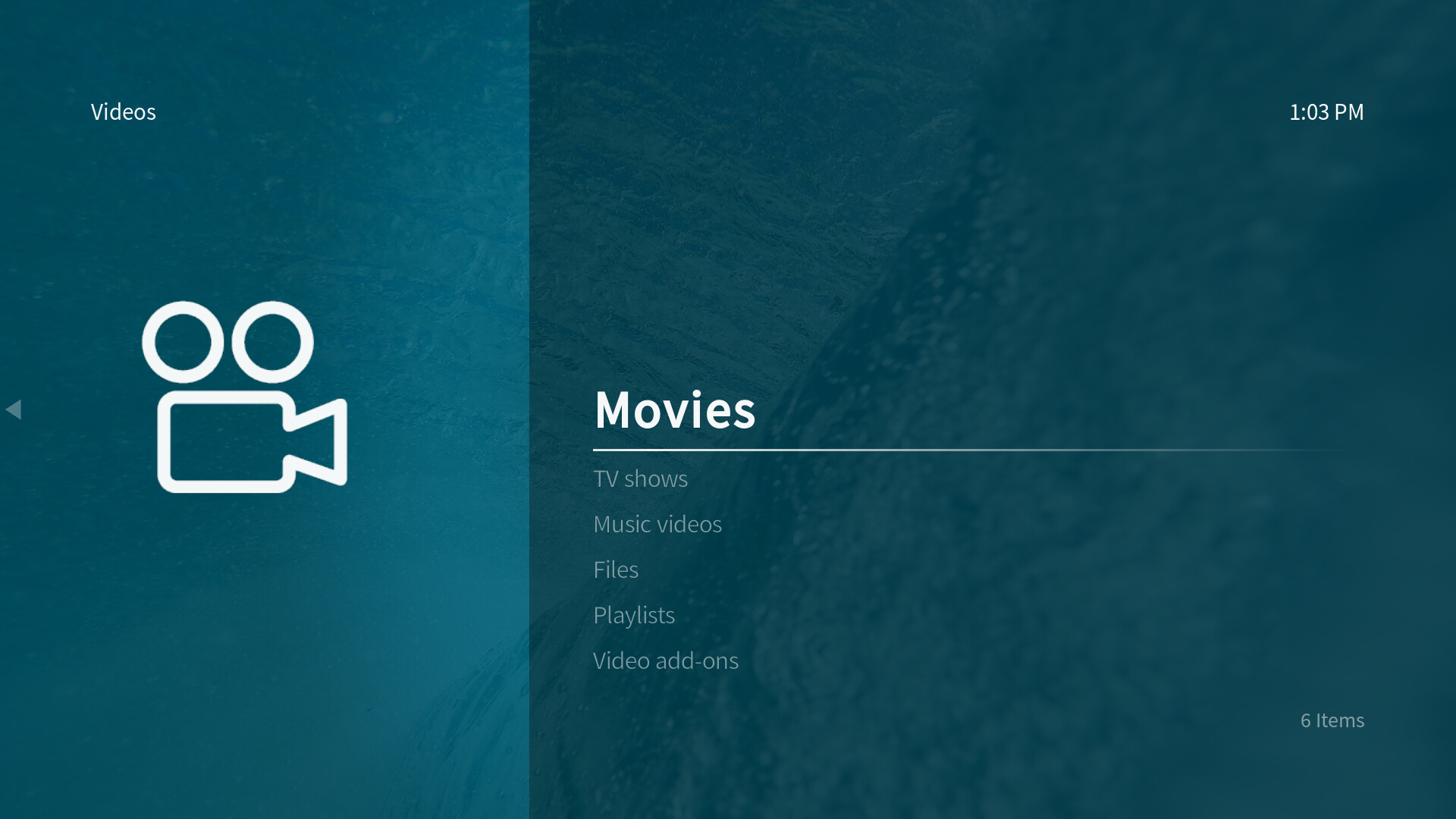
The default view of the OSMC Skin is the List view which is the fallback for all windows.
It’s available in all windows independent of the content.
Most folders will use this list view which provides a second information label below the focused title in the list:
Mostly for file views, a simpler list is used that doesn’t feature the second information label:
List info
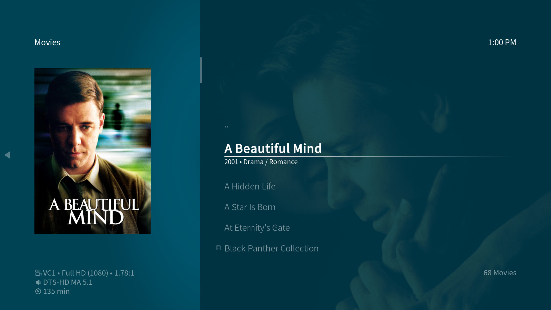
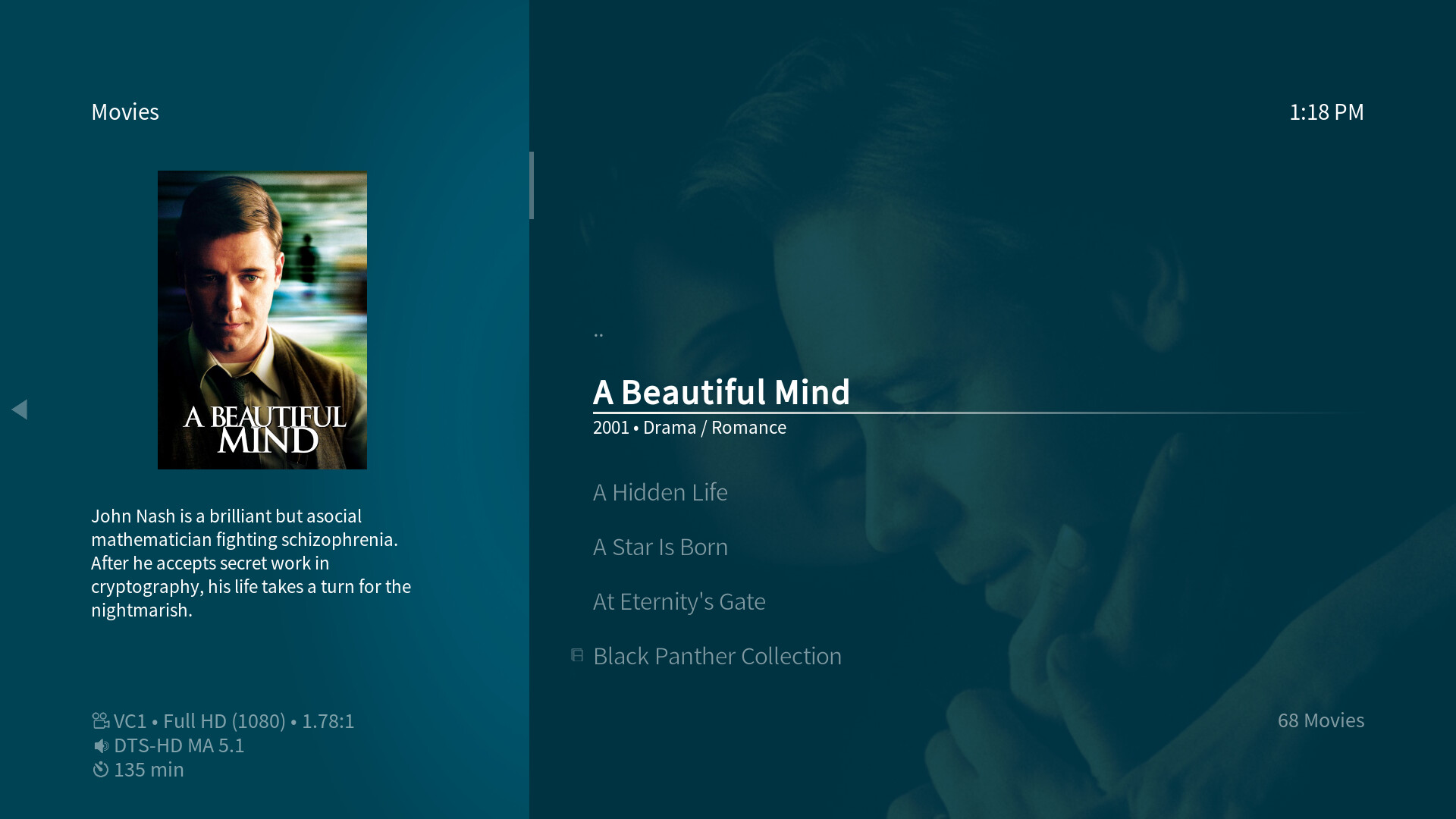
A sub-view of the List view is List info which features an additional plot text box right below the cover art. The plot text size can be adjusted via the skin settings.
The video List info view which is available for movies and TV shows:
A slightly different List info view which is available for programs, games and addons:

Episode list
This view cannot be selected manually - it’s only available for TV show episodes where it’s automatically chosen and it’s also the exclusive view for TV show episodes. The plot text size can be adjusted via the skin settings.

Wide
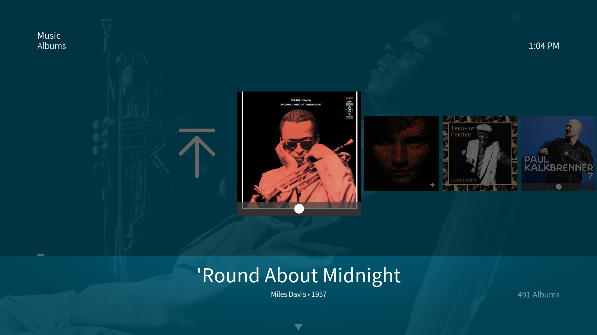
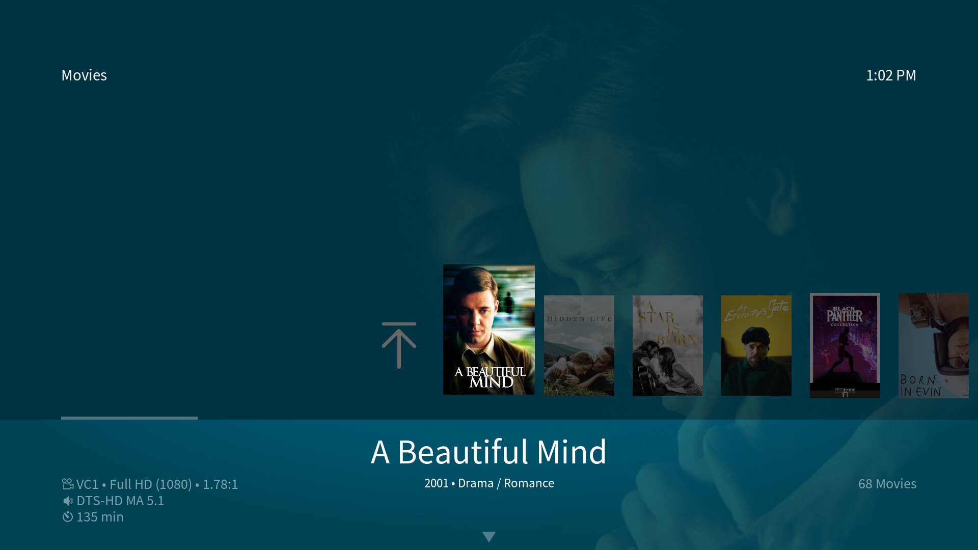
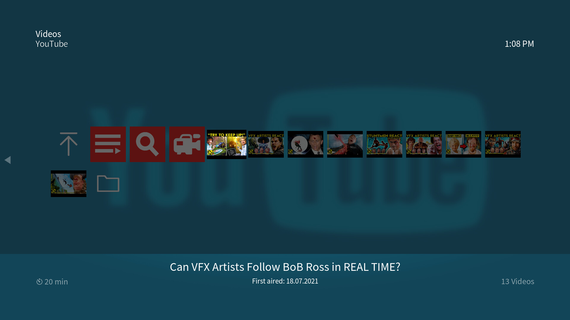
The Wide views make up the horizontal view set which offer more space to the currently focused cover art than other views.
The video Wide view which is available for movies, TV shows, TV show seasons:

A slightly different Wide view which is available for music artists, music albums and programs, games as well as addons:
Wide low
The Wide low view offers more space to let users see the background fanart. It’s a compromise of both lots of visible cover art as well as the maximum space for background fanart.
The video Wide low view which is available for movies, TV shows, TV show seasons:
A slightly different Wide low view which is available for music artists, music albums and programs, games as well as addons:
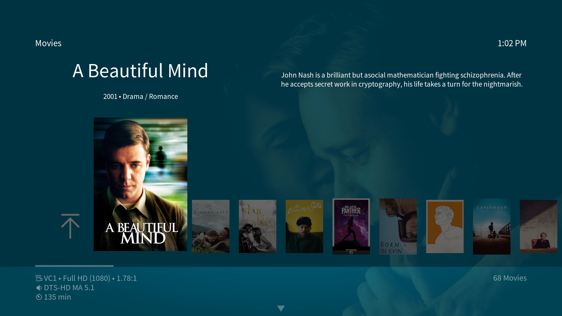
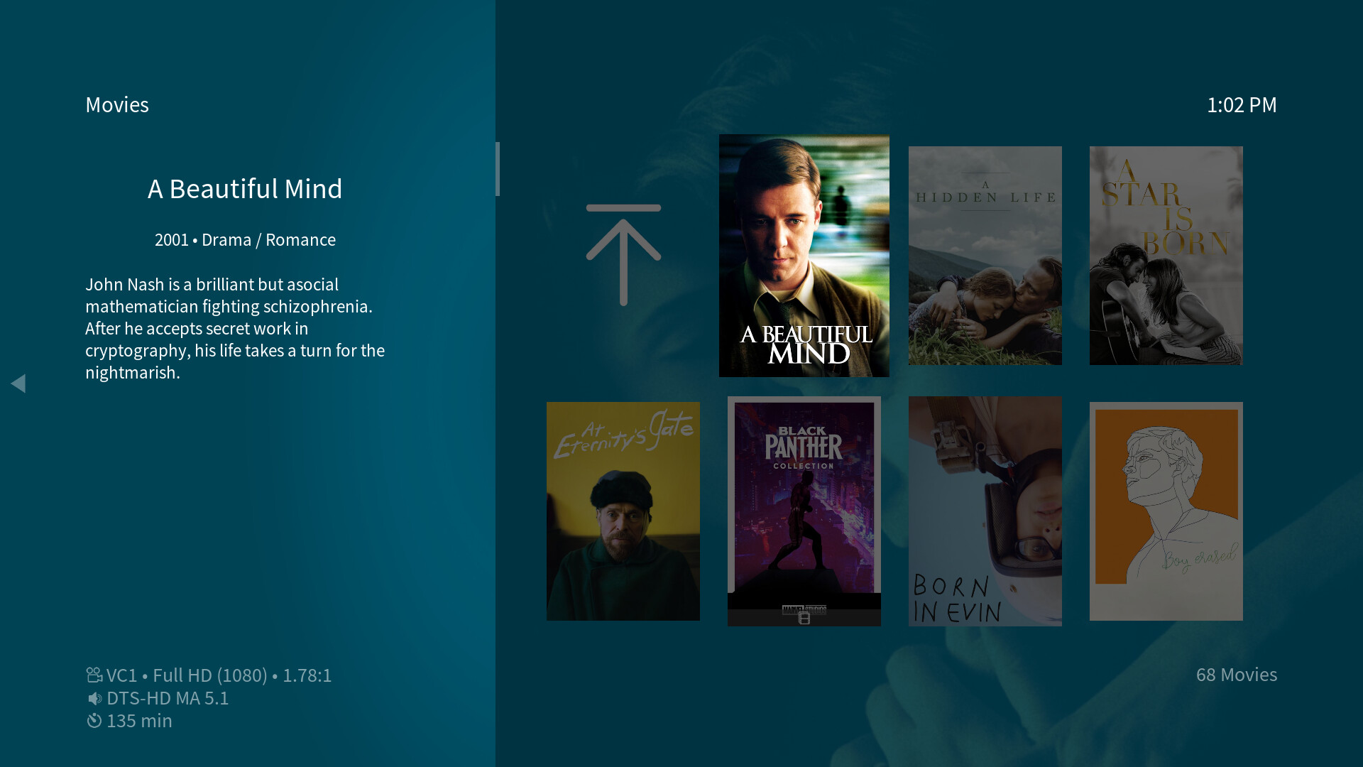
Wide info
Same as the List info view, the Wide info view adds plot information. The focused cover art is moved to the left half of the window to give the plot text enough space while still offering a decent size of cover art. The plot text size can be adjusted via the skin settings.
The video Wide info view which is available for movies and TV shows:
A slightly different Wide info view which is available for programs, games and addons:
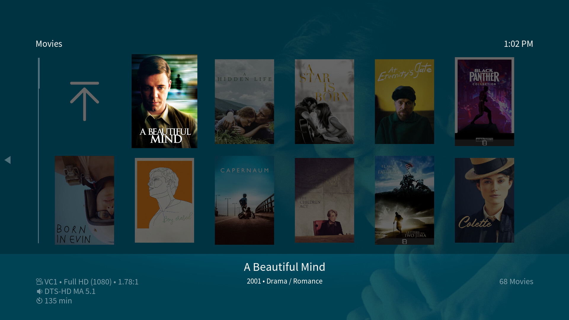
Wall
There are two different basic Wall views available in the OSMC Skin depending of the content of the current window.
The video Wall view which is available for movies, TV shows and TV show seasons:
A slightly different Wall view which is available for music artists, music albums and programs, games as well as addons:

There’s a wider variety of additional wall views available for other specific media content types:
Wall info
Again, this view adds plot information to the standard Wall view by sliding the wall cover panel to the right, giving space for title, year, genre and plot text. The plot text size can be adjusted via the skin settings.
The video Wall info view which is available for movies and TV shows:
A slightly different Wall info view which is available for programs, games and addons:
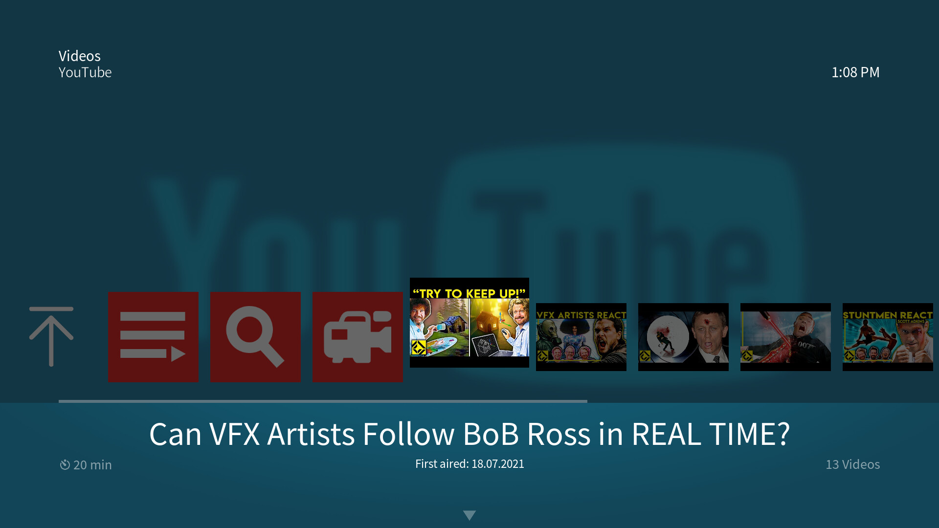
Wall small
The Wall small view is specifically made for folders which contain a huge amount of titles. As the covers are significantly smaller, you can see a lot more titles per page than with the standard Wall view.
The video Wall small view which is available for movies, TV shows and TV show seasons:

A slightly different Wall small view which is available for music artists, music albums and programs, games as well as addons:
Wall small info
Here, we’ve added another info version of a standard view by adding plot information. The plot text size can be adjusted via the skin settings.
The video Wall small info view which is available for movies and TV shows:
A slightly different Wall small info view which is available for programs, games and addons:
Wall low
This view is a compromise of the Wall small view and better visibility of the background fanart. It basically sits somewhere between Wide low which features just one horizontal line of cover art and Wall small which fills the whole screen with covers, but offers more than one line of titles to scroll through.
The video Wall low view which is available for movies and TV shows:

A slightly different Wall low view which is available for programs, games and addons:
Customizable main menu including widget support
The main menu, including the widgets and the submenus of each of the main menu items can be fully customized via the main menu customization dialog. A fresh OSMC install will feature a default main menu layout that you can always fall back to. In the General section of the skin settings you’ll find the item Enable main menu customization which will ask you to install one addon when clicked on: the Skinshortcuts script. This script is needed to enable the main menu customization feature.
After the script is installed, you’ll see a new item in the General section of the skin settings: Customize main menu, which will open the main menu customization dialog…
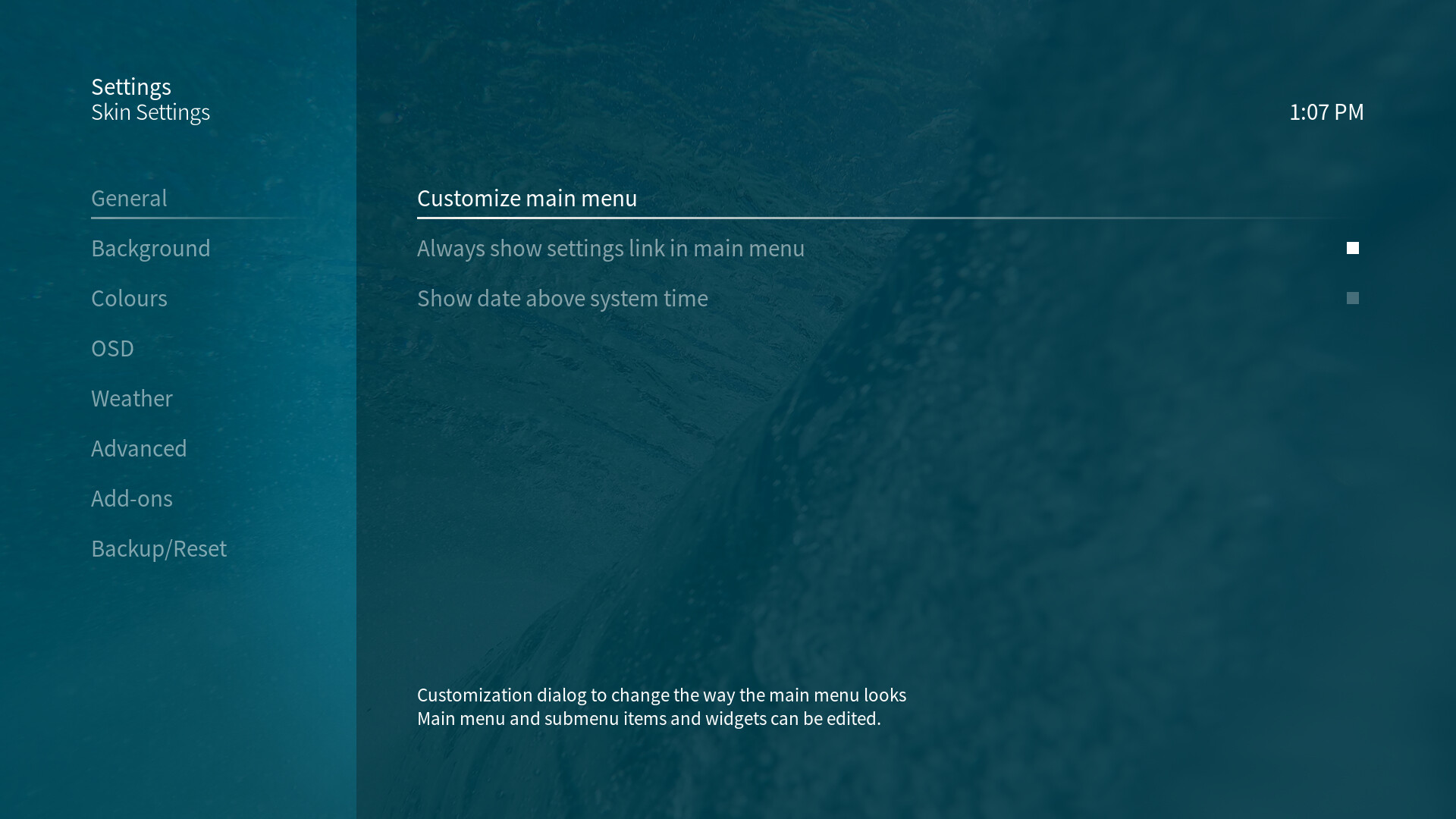
Each of the currently focused items of this dialog are explained in the text box on the bottom of the dialog right above the horizontal dialog button menu. A help overlay can be activated with the option Help in that button menu.
For a step-by-step guide for how to customize the main menu, please have a look here.
Customizing music and video library views
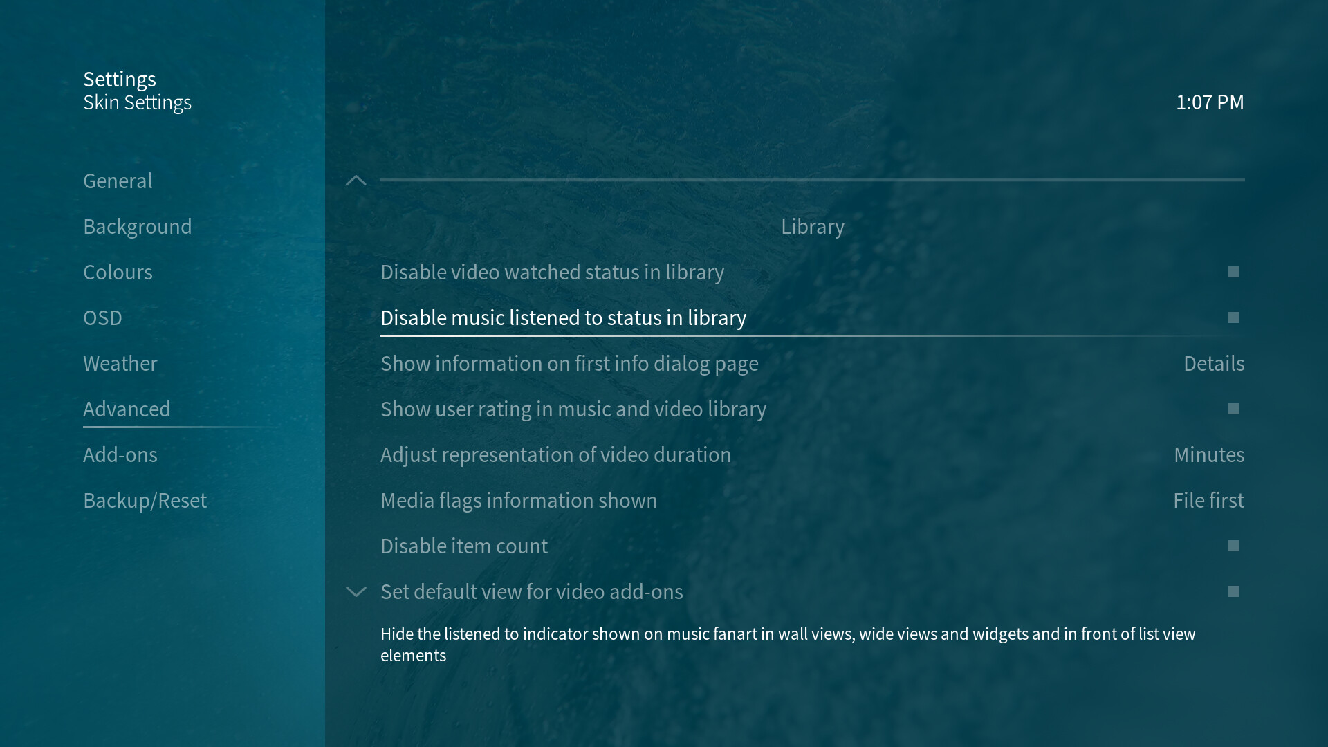
Besides the different views available, library related skin settings let you toggle quite a few things in library views:
-
Disable video watched status in library
This lets you hide the watched indicator shown next to (partly) watched videos in lists or on video cover art. -
Disable music listened to status in library
This lets you hide the listened to indicator shown next to (partly) listened to music in lists or on music cover art. -
Show user rating in music and video library
This enables Kodi’s user rating feature for music and video library items. It enables a button to adjust the user rating in info dialogs and shows the set user rating in library views and info dialogs. -
Adjust representation of video duration
Depending on taste and habit, this lets you adjust whether the duration of movies and TV show episodes will be shown as minutes only or as hours and minutes in library views and info dialogs. This does not affect the duration representation of music titles. -
Set default view for video addons
As Kodi only remembers a view selection for every individual video addon page, this setting forces a specific view for all video addon pages.
Media flags
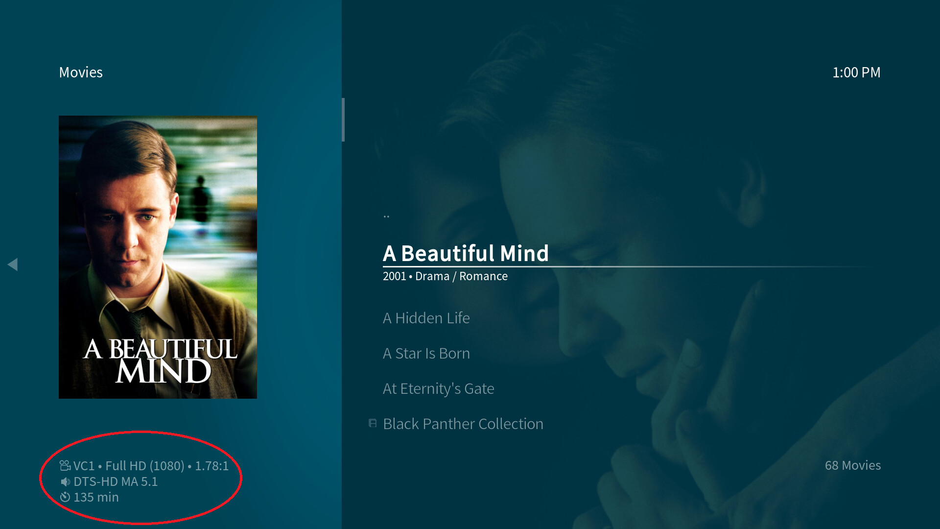
Media flags shown by the OSMC Skin are mostly relying on the media info provided by the media scraper - the behaviour of how and when the media flag information is shown have been described very accurately by @nabsltd:
The info is stored/refreshed in the database when the file is scanned by the scraper, and every time a file is played. This means if you change the content of the file in some way without changing the name, the flags don’t update in views until you play the file again. You only have to play for a few seconds to have the info updated.
There are only four media flags which rely on file naming:
- Atmos in this form: Atmos
- DTS:X in these forms: DTS-X, DTSX
- AURO-3D in these forms: AURO-3D, AURO3D
- 3D video in these forms: H-SBS, HSBS, H-TAB, HTAB, H-HOU, H-OU, SBS, TAB, OU, 3D (the first nine provide additional detail in the media flags for the type of 3D content - half resolution and full resolution side-by-side, top-and-bottom/over-under, 3D is useful for MVC files)
These four have to be included in the file name (they’re not case sensitive) and they all have to be surrounded by any combination of these characters: . - _
Space is not allowed before or after those labels in your filenames and they shoudn’t be at the beginning of your filename.
The three audio tags will be shown only if the first audio stream of the video file is an appropriate base track for the 3D audio format in question (Dolby TrueHD or Dolby Digital Plus for Atmos, DTS-HD MA or DTS-HD HRA for DTS:X, LPCM with 5.1 or 7.1 channels or DTS-HD MA for AURO-3D). For more information on 3D audio also see here.
The 3D flag showing up can also rely on information provided by Kodi without the requirement of correct file naming, but this only works after first playback (it’s a limitation of how the information used is provided).
Here’s a full list of media flags that the OSMC Skin provides (all feeding on information of the scraper, NOT filenames):
-
Audio:
AAC, Dolby Digital, AIFF, AIFC, Apple (ALAC), APE, AVC, Audio-CD, DTS, Dolby Digital, DTS-HD HRA, DTS-HD MA, Dolby Digital+, FLAC, MP1, MP2, MP3, OGG, Opus, PCM, Dolby TrueHD, Vorbis, WAV, WAVP, WMA -
Video:
3IV2, AVC-1, Blu-ray, DivX, DVD, FLV, H.264, HD-DVD, H.265, MPEG-4, MPEG-1, MPEG-2, RV40, SVQ1, SVQ3, Theora, TV, VC-1, VHS, Webm, WMV, XviD
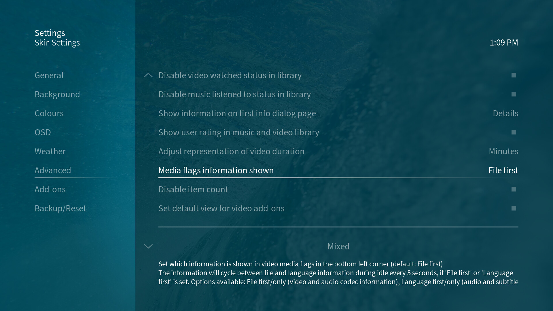
Customizing the media flags
The media flags for video files can be adjusted. By default, they offer two sets of information which are shown in an alternating manner every 5 seconds during idle: file codec information (video codec, resolution and aspect ratio, the first audio stream’s audio codec and channel layout) and secondly language information (language codes of the first four audio and subtitle streams). This options lets you adjust which of the two should be shown first, whether only one of the two should be shown, whether only duration information should be shown or whether the media flags should be hidden entirely.
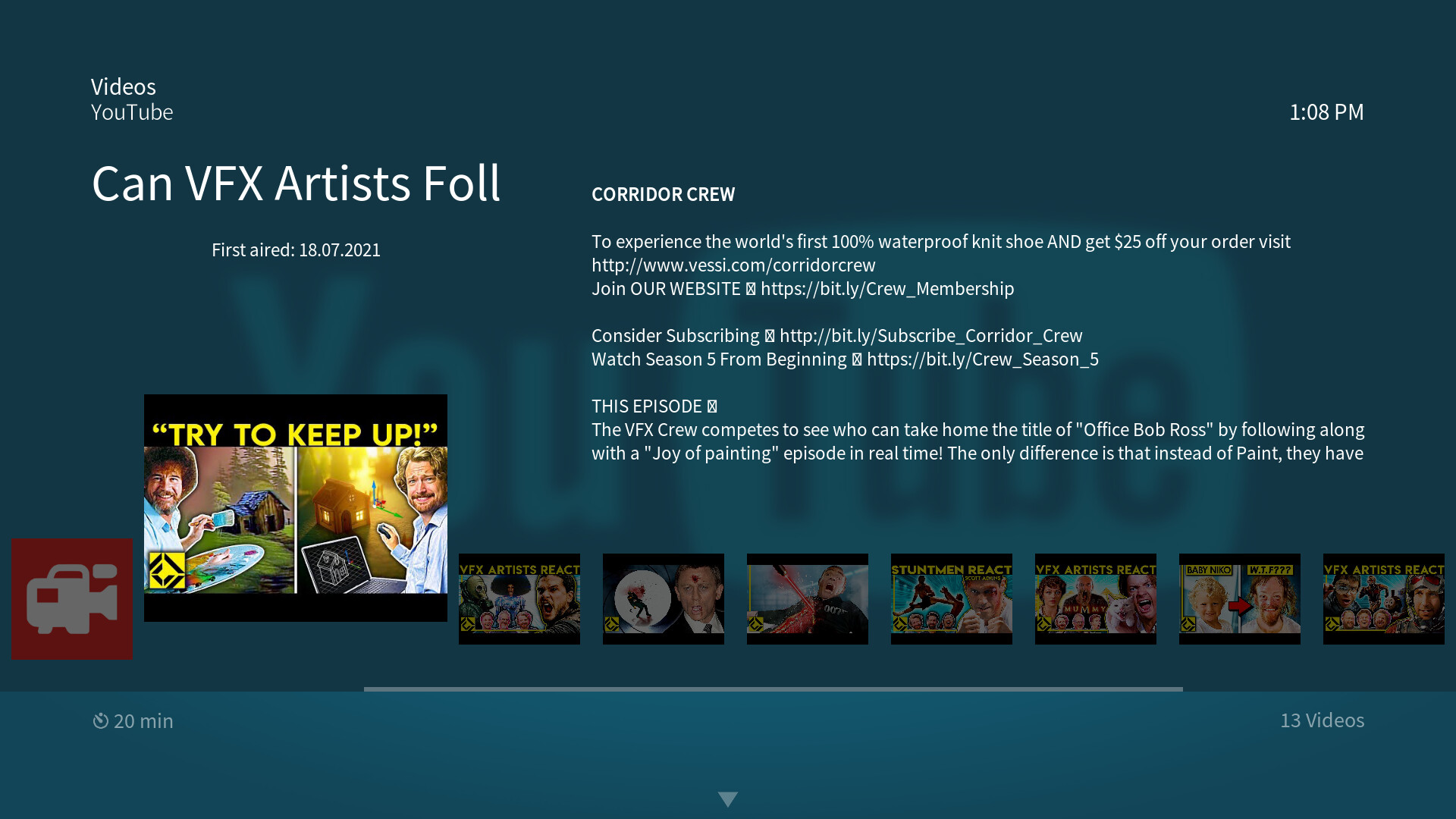
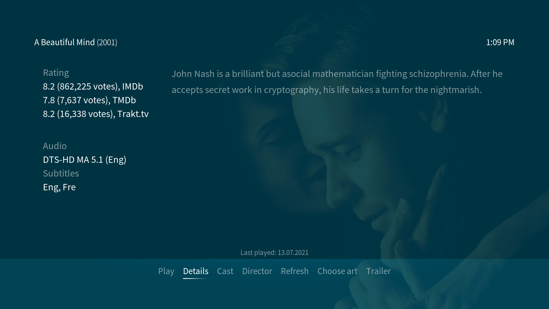
Customizable video info dialog
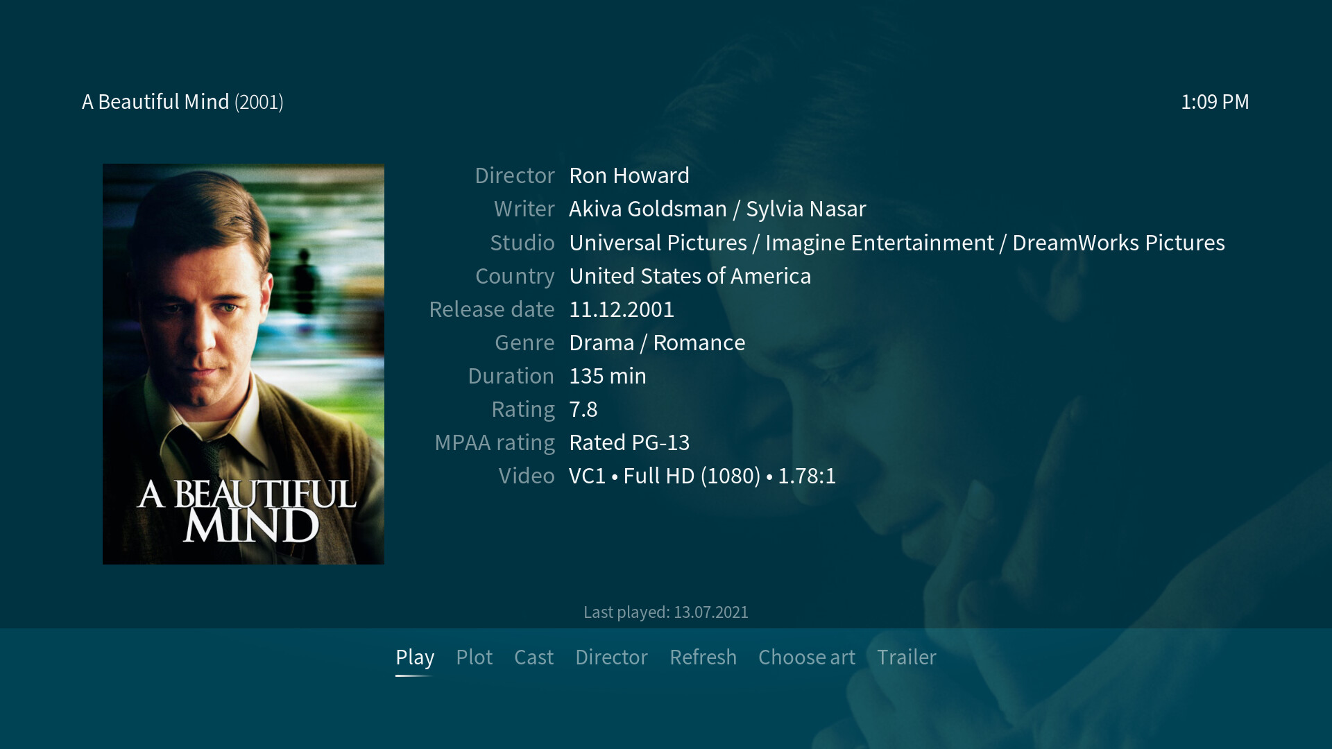
As the video library mostly contains a lot of information when movies and TV shows are scraped properly, the video info dialog offers more space to show this information than other info dialogs. The default, initial view offers a large cover art as well as information about things like genre, director, writer, basic rating, etc.
There’s more space for information on the second page of the video info dialog. This will be shown when clicking on Plot:
A large plot text is available here which should let you read even long plot descriptions without readability issues. There’s also additional ratings information and information on the first four audio and subtitle streams embedded in the video file.
You may choose which information should be shown first when opening the video info dialog. The default shows the cover art and a list of information while the second page shows additional ratings, the first four audio/subtitle streams’ information and a plot text. This setting lets you choose between this default and a second option where the first page contains cover art and plot text and the second page a list of information together with additional ratings and the first four audio/subtitle streams’ information.
Customizable music player OSD
The music player OSD offers current playback information as well as playback controls. You can toggle through multiple possible views via the i (info) button in the OSD:
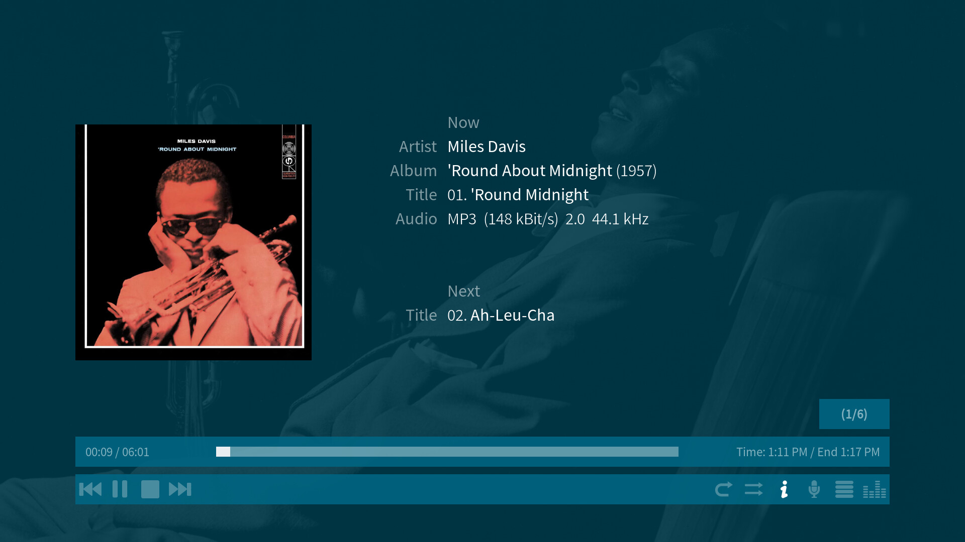
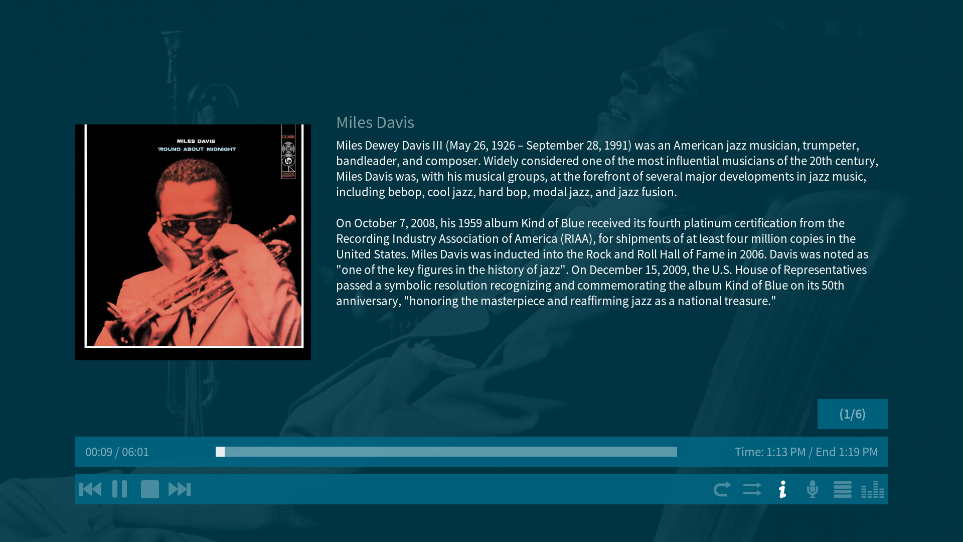
Whether the current playback cover art as well as the music information of the currently and next playing title(s) should be shown can be controlled by the i (info) button in the OSD or on your remote/keyboard or by a skin setting that overrides the default i (info) button Kodi behaviour which toggles whether the music playback information (album cover, current artist, album, title, etc. and next artist, album and title) are shown (briefly/at all). This way, you may set that these playback information are always shown no matter what the state of the Kodi i (info) button setting is.

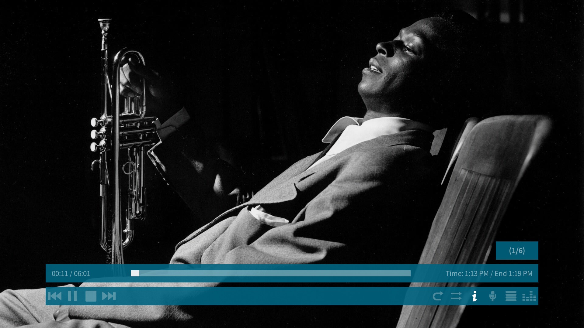
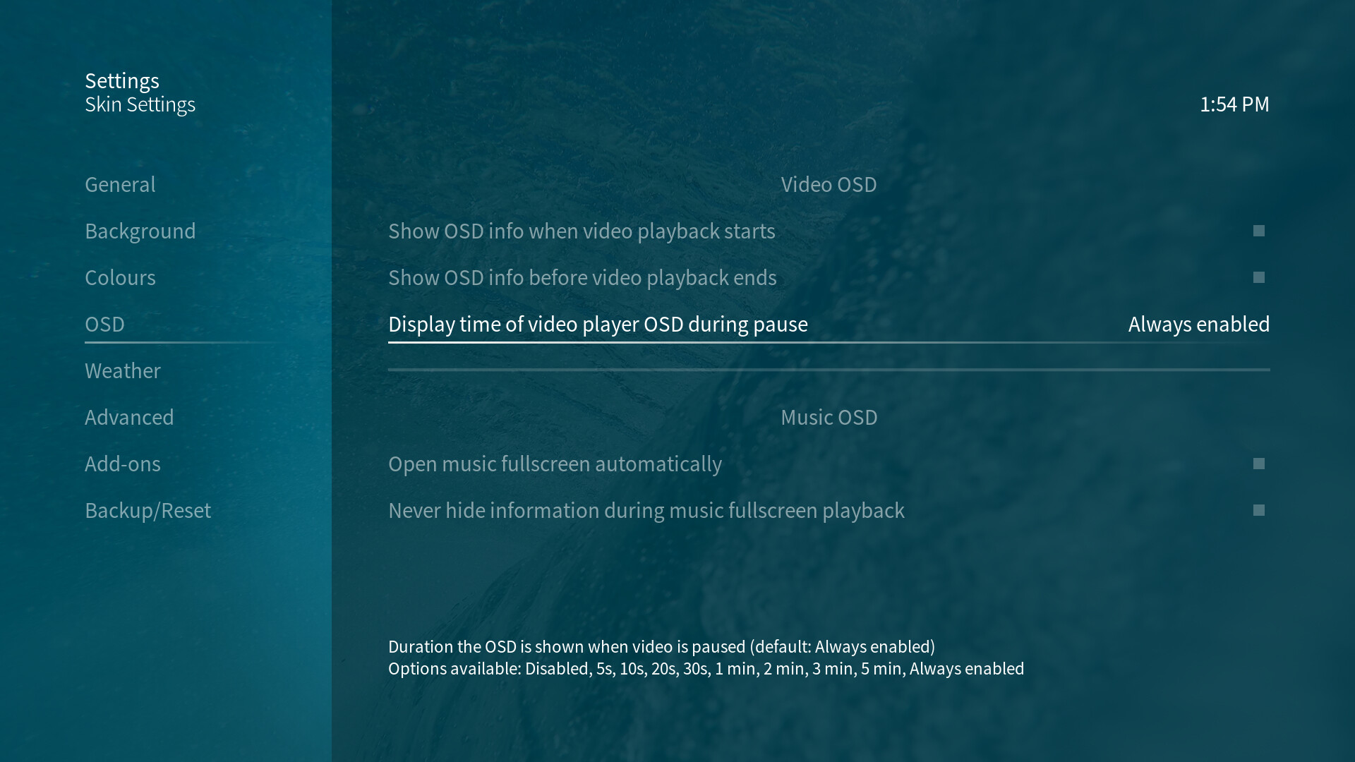
Customizable video player OSD
During skipping, rewinding/fast forwarding and pausing of video playback the playback progress bar shows up:
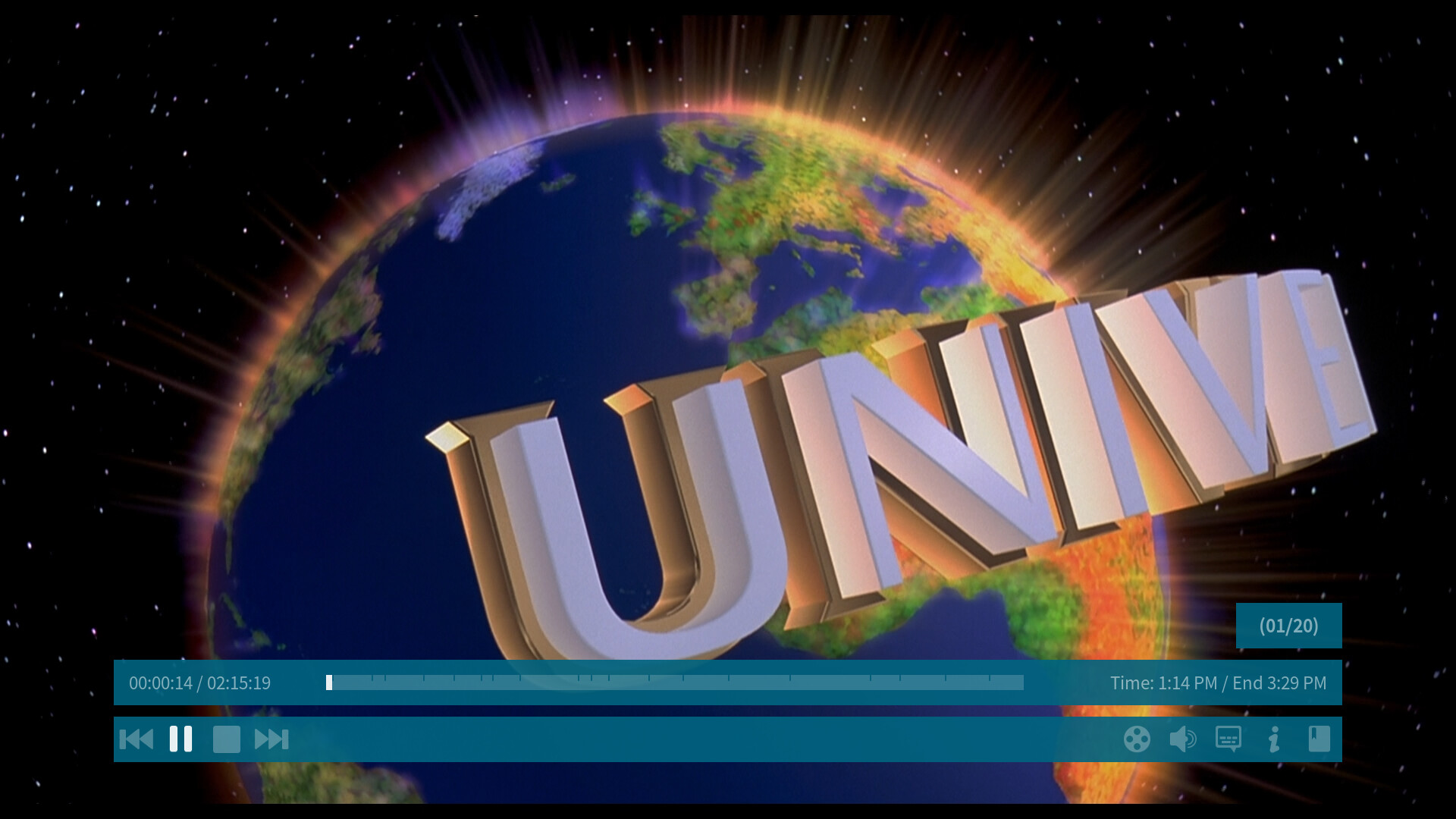
A skin setting lets you adjust for how long the video player OSD progress bar should be shown while playback is paused. It allows you to toggle between a given set of values including Never which prevents the progress bar from showing up during pause entirely.
Customizable skin colours
In the Colours section of the OSMC Skin settings, you may adjust all colours visible in the OSMC Skin to your own liking. To make the choice easier, we offer a few colour sets to choose from which adjust text, overlay and background colours so they match perfectly:
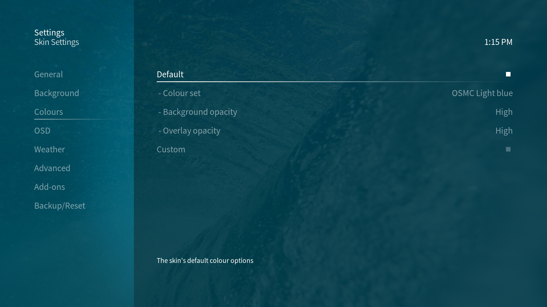
If this is not enough for you, you can adjust all visible colours manually:
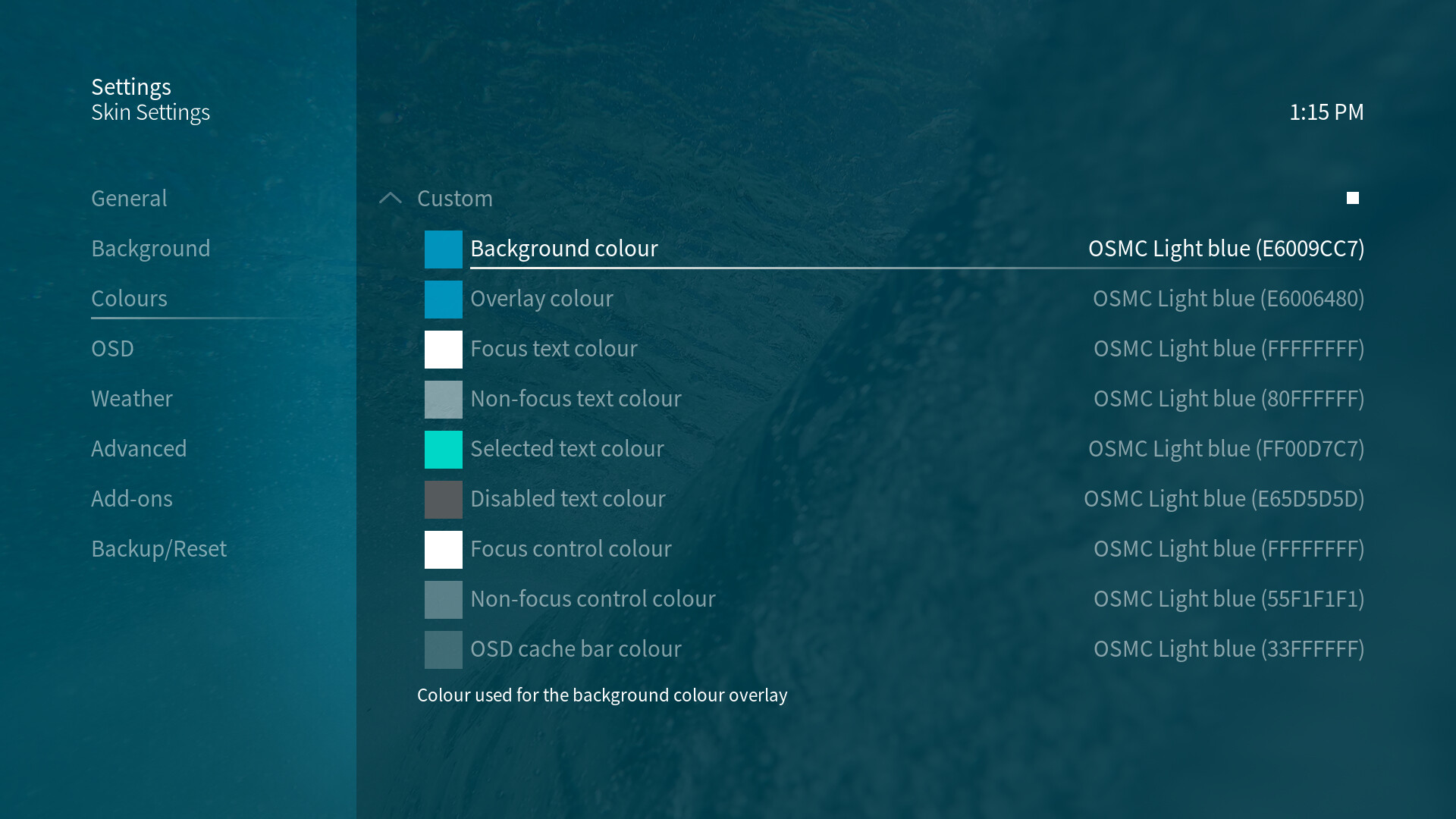
Additionally, you can adjust the general opacity of the background overlay which is visible on top of background art and the overlay opacity of submenus and notifications as well as the music and video player OSD. The background colour gradient can be adjusted with five different options as well.
This should give you the freedom to fully adjust the looks of the OSMC Skin to your own taste!
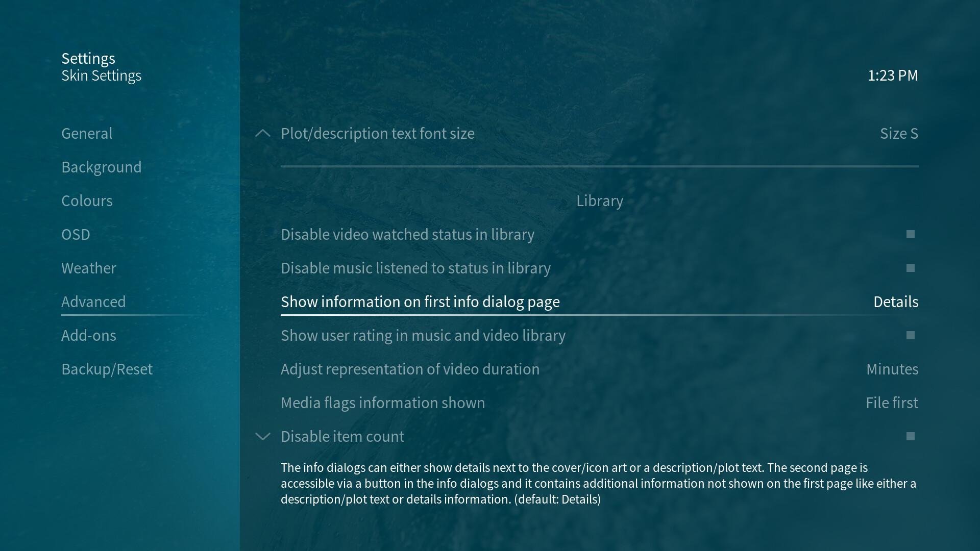
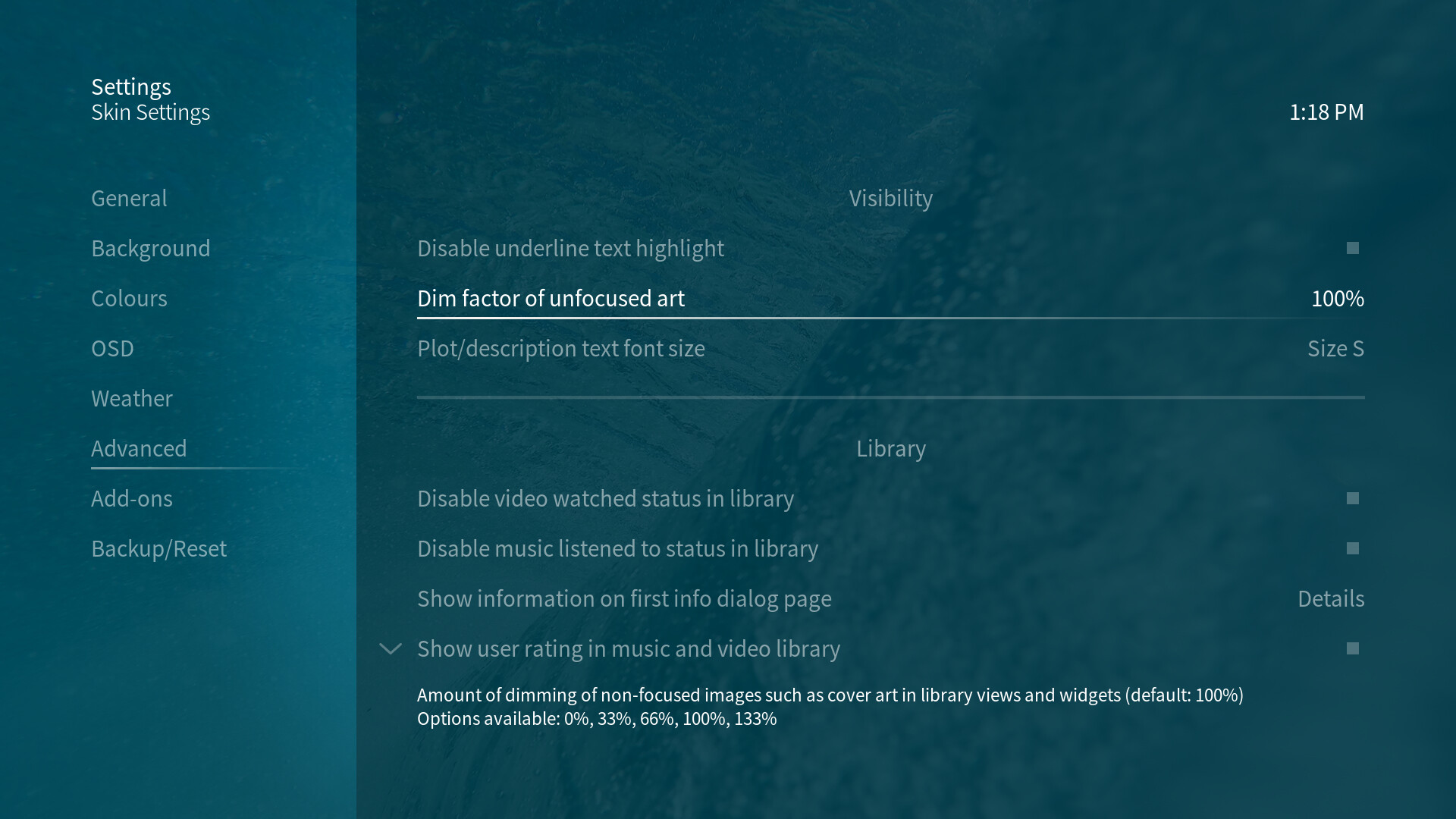
Readability and visibility customizations
In the Advanced section of the OSMC Skin settings there are three options to address accessibility issues:
-
Disable underline text highlight
The underline text highlight should improve visibility of focused buttons. With this setting you can hide the hightlight - e.g. if you don’t need the extra highlight and prefer a more sleek skin experience. -
Dim factor of unfocused art
On some screens, dimmed cover art might be hard or near impossible to see. On the other hand, it might be useful for some users to be able to increase the difference between focused and unfocused art. This toggle lets you change the amount of dimming applied to unfocused art between a very high value and no dimming at all. -
Plot/description text font size
Another visibility issue that has come up every now and then was the readability of information texts throughout the skin. To address this, we’ve introduced adjustable plot and description font sizes. This setting changes how big these texts are shown on screen in various media windows and OSD info dialogs.
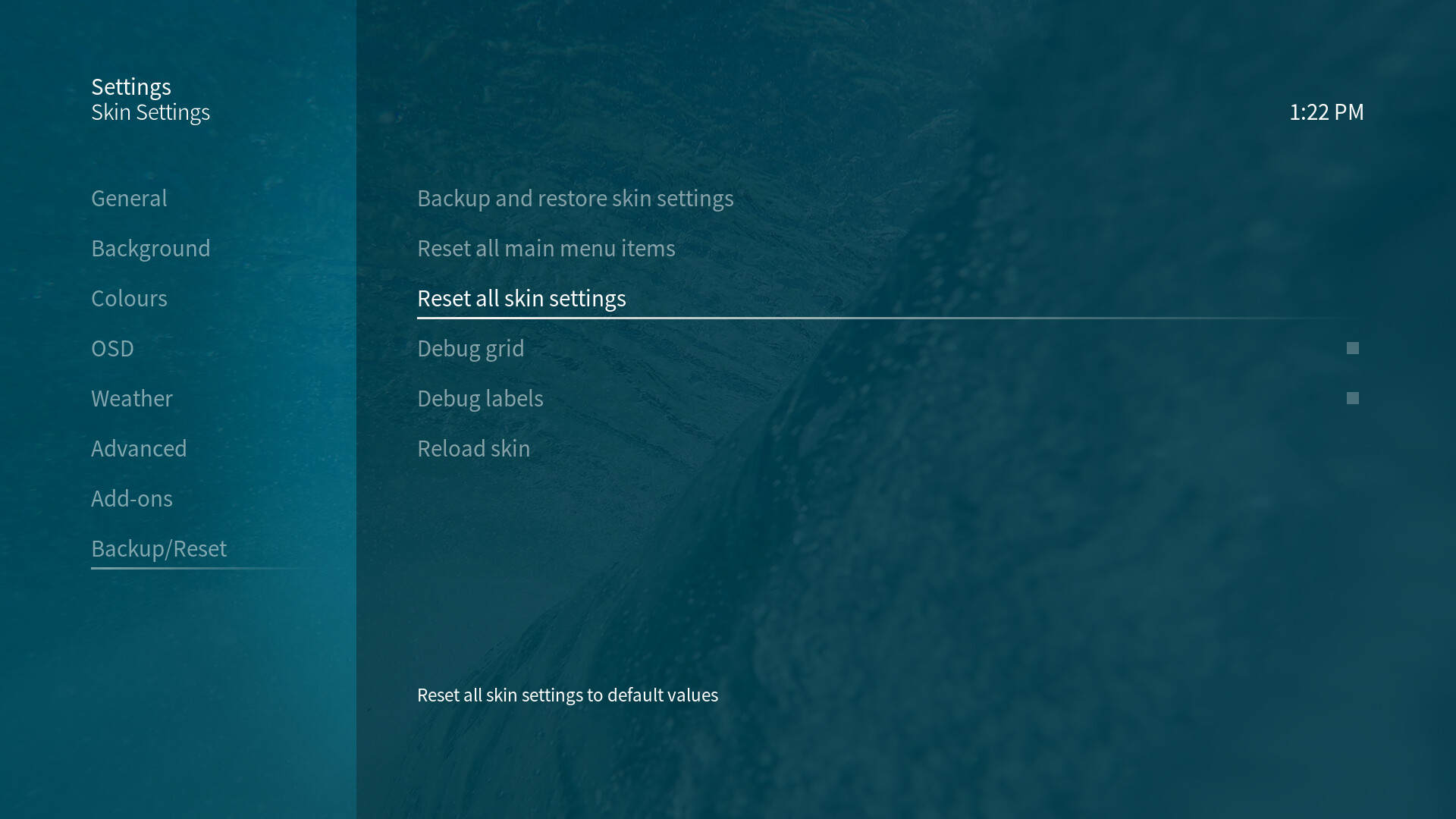
Reset and backup functionality
In the Backup/Reset section of the OSMC Skin settings there are three options to easily backup and reset skin settings and main menu customizations:
-
Backup and restore skin settings
With the help of the Skin Helper Service Skin Backup script you can backup and restore all of your skin settings including your main menu customizations.
Via the dialog showing up when you click on this option, you can adjust where the backup should be saved to and whether a backup should be created periodically:
-
Reset all main menu items
All main menu customizations can be reverted by using this toggle. The main menu will be reset to the default layout the OSMC Skin is shipped with. -
Reset all skin settings
To reset the OSMC Skin to default settings, use this setting. It will not touch your main menu customizations, but it will reset all other OSMC Skin settings to default values.

Supported addons
These addons are recommended to be used with the OSMC Skin:
- Skin Shortcuts
- Skin Helper Service (For Kodi v19 and following, this add-on is currently only available from ‘Marcelveldt’s BETA repository’ which has to be installed manually.)
- Skin Helper Service Widgets (For Kodi v19 and following, this add-on is currently only available from ‘Marcelveldt’s BETA repository’ which has to be installed manually.)
- Skin Helper Service Skin Backup (For Kodi v19 and following, this add-on is currently only available from ‘Marcelveldt’s BETA repository’ which has to be installed manually.)
These addons enable you to customize the main menu as well as offer additional widgets and backup options for the skin settings.
These addons are supported by the OSMC Skin (specific adjustments have been made to let you use these addons seamlessly with the OSMC Skin):
The OSMC Skin doesn’t require you to install any addons. Those above are specifically supported and recommended, but none of them have to be installed in order to use the OSMC Skin.